Face the Fear: Purple and Green
I’ve never been naturally drawn to either purple or green hues (although I did flirt with lilac combined with powder blue in my early 20s… moving swiftly on). It doesn’t matter whether I like those hues or not; especially when I’ve been asked to design a space to incorporate purple. And lots of it. But what I can do is encourage various ways of utilising a person’s (or client’s) favourite colour without going overboard, or introducing complementary or harmonising colours to a scheme thereby refining the original ideas expressed by the client.
It’s also a great learning curve for me (as an aspiring interior designer) to learn how to create design schemes where I have to crawl (sometimes kicking and screaming) out of my comfort zone. This is one of those times. I mightn’t have learned to appreciate purple and green as colours in their own right, but I do appreciate how effective they look side-by-side in a design scheme.
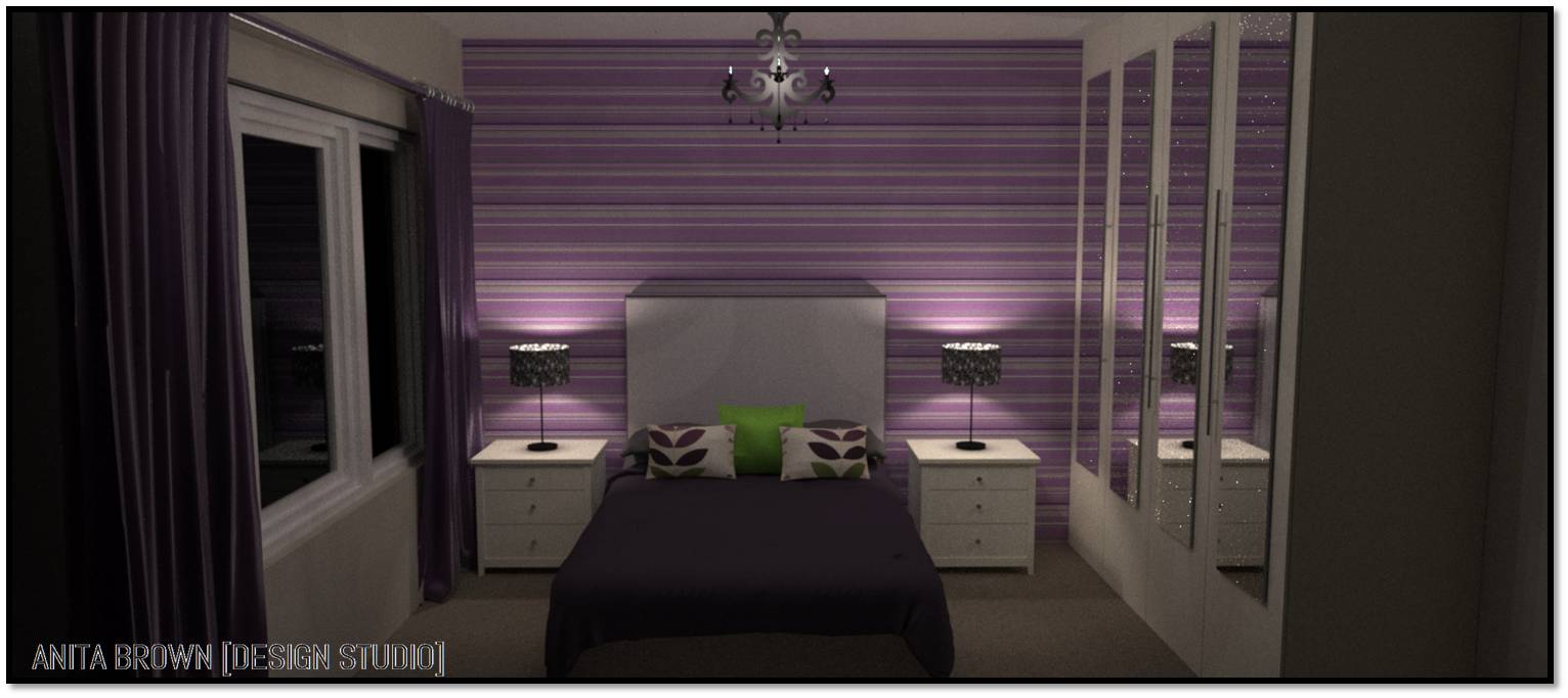
Objective: incorporate purple; work with white bedroom furniture, and keep the space fairly modern.
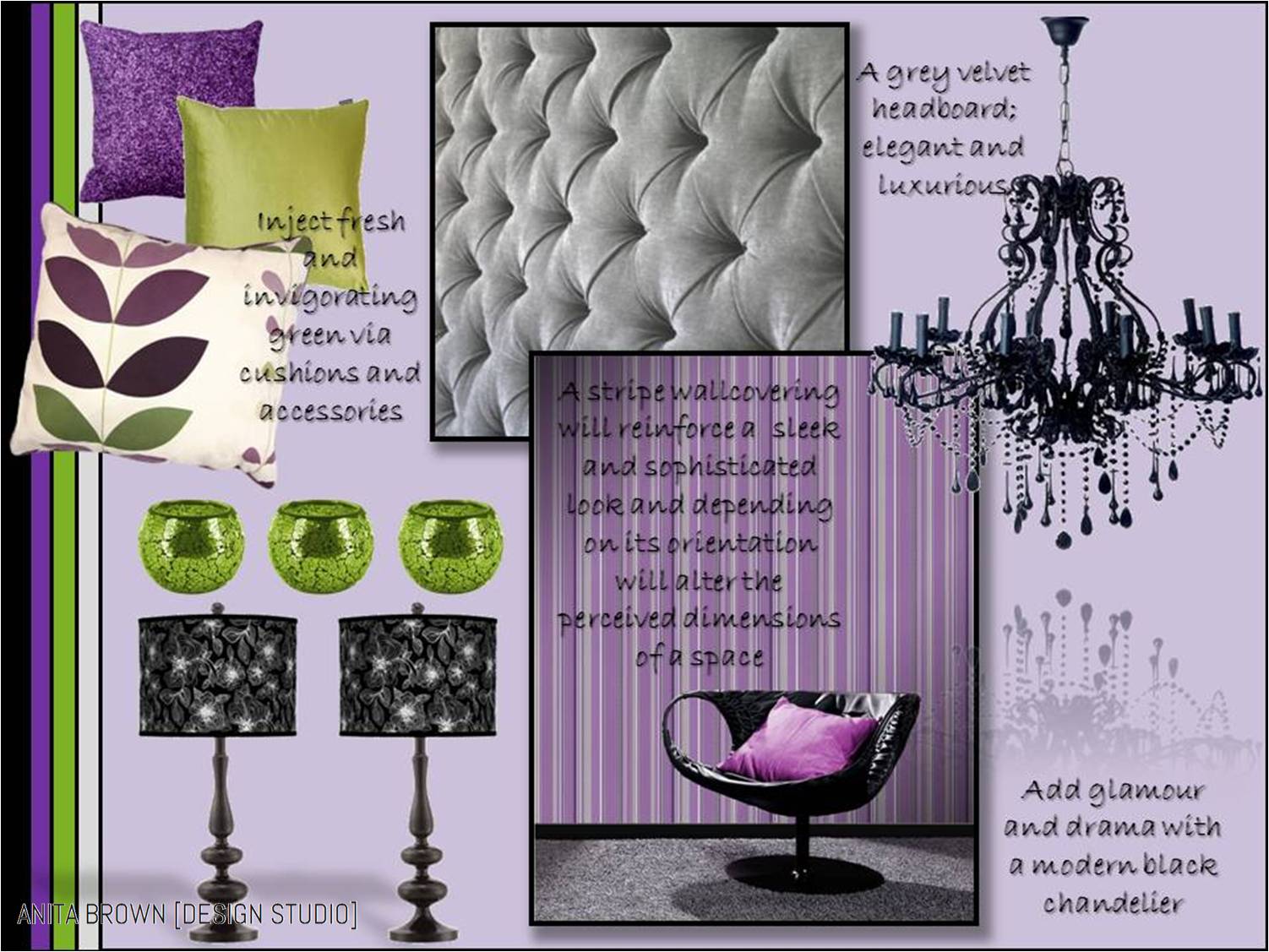
This space is a bedroom that already has neutral walls (Egyptian Cotton) and a neutral carpet. The solution to incorporating purple? You guessed it: a feature wall. Never underestimate the power of a feature wall. NEVER! Anything is possible with a feature wall! ANYTHING! The fact that it’s only a portion of the room means that most designs, colours and patterns can be accommodated. I was immediately drawn to a purple stripe – striped wallpaper reminds me of a pinstripe suit; it’s streamlined, elegant and uber sophisticated. This particular striped wallpaper includes lavender, purple, grey and white. The white bedroom furniture is non-negotiable so instead of working against it, I worked with it. And the white stripe in this wallcovering does just that – it complements the white already in use within this space. 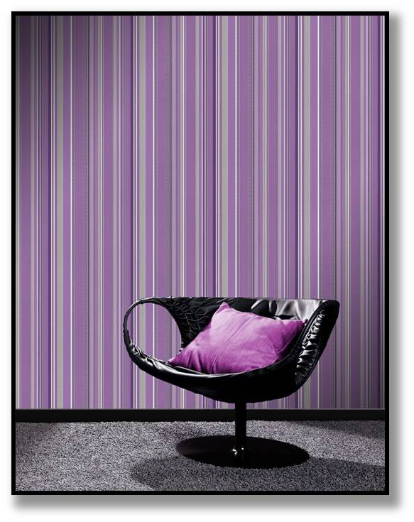
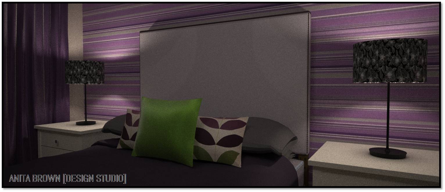
I have also picked out the use of grey by suggesting that the headboard is upholstered in a grey fabric. Budget permitting my preference would be velvet – a bedroom should include luxurious, tactile and comforting fabrics. In my opinion, you can’t get much more luxurious than pure unadulterated velvet.
After finalising my choice of wallcovering I turned my attention to lighting. I opted for a black modern chandelier with lampstands/shades. Black adds depth; it is unquestionably sleek and it also creates a little bit of drama. The chandelier in itself will provide an element of glamour and the lampshades with their white highlights also help to pull together the use of white in the space. The linear floral pattern on the lampshades also helps to provide relief from the stripe pattern.

The use of purple in this space also extends to the bedding and window treatments. However, the deeper shade of purple within the striped wallpaper has been used – this layered use of colour ensures visual interest whilst maintaining consistency with the colour palette of the room. I have suggested faux silk for the curtains to reinforce the feeling of glamour and luxury.
And lastly the cushions. A subtle (and slightly retro inspired) floral print contrasts with the stripe pattern (but also compliments its colour palette of various shades of purple and white) but also includes green. This will help to visually lift the use of purple elsewhere and has been reinforced with an additional green cushion.
I have attached 3D rendered visuals of how this space could look in reality. It’s proof that a space can combine pattern in various forms; colour of various hues and a little bit of drama and glamour but still have an overall soothing effect.


4 Comments
Hi Neets, I dont think people realise just how well/nice these colours go together. I’m not a fan of lilac (i know your’re talking about purple), it reminds me of a cheap naff cololur, but if you steer more to the purply tones of lilac then you venturing in to another dimension altogether me thinks!! x
LikeLike
You’re probably right – I certainly didn’t realise just how well they go together; that ‘ol colour wheel is obviously a lot more accurate than I thought!! x
LikeLike
Do you have the details of the wallpaper featured here?
Thanks
Steven
LikeLike
Hi Steven, thanks for taking a peek! I sure do: http://www.worldstores.co.uk/p/Rasch_Queens_Stripe_Plum_Wallpape_10m_Roll.htm I’ve also seen this wallpaper in the flesh and it looks just as good in reality 😉
LikeLike