Photoshop – The Only Limitation is your Imagination
I’ve been using a multitude of effects via Photoshop and GIMP recently for my degree studies. I usually find that all of the tools to create whatever effect you want are all readily available in the maze of menus and sub-menus in both Photoshop and GIMP; it’s knowing which ones to use is the problem. But then knowing exactly what effect you’re after is also extremely important.
I’ve spent many a night sitting in front of my laptop working on a report or a presentation and wondering what on earth I could do with certain images to make them come alive, to entice the reader or reinforce a point I’m trying to make. Or sometimes I just play around with effects in the name of creativity.
But continually coming up with new ideas of presenting visual information can be a painful process. But when you get it right; it’s a great feeling of accomplishment.
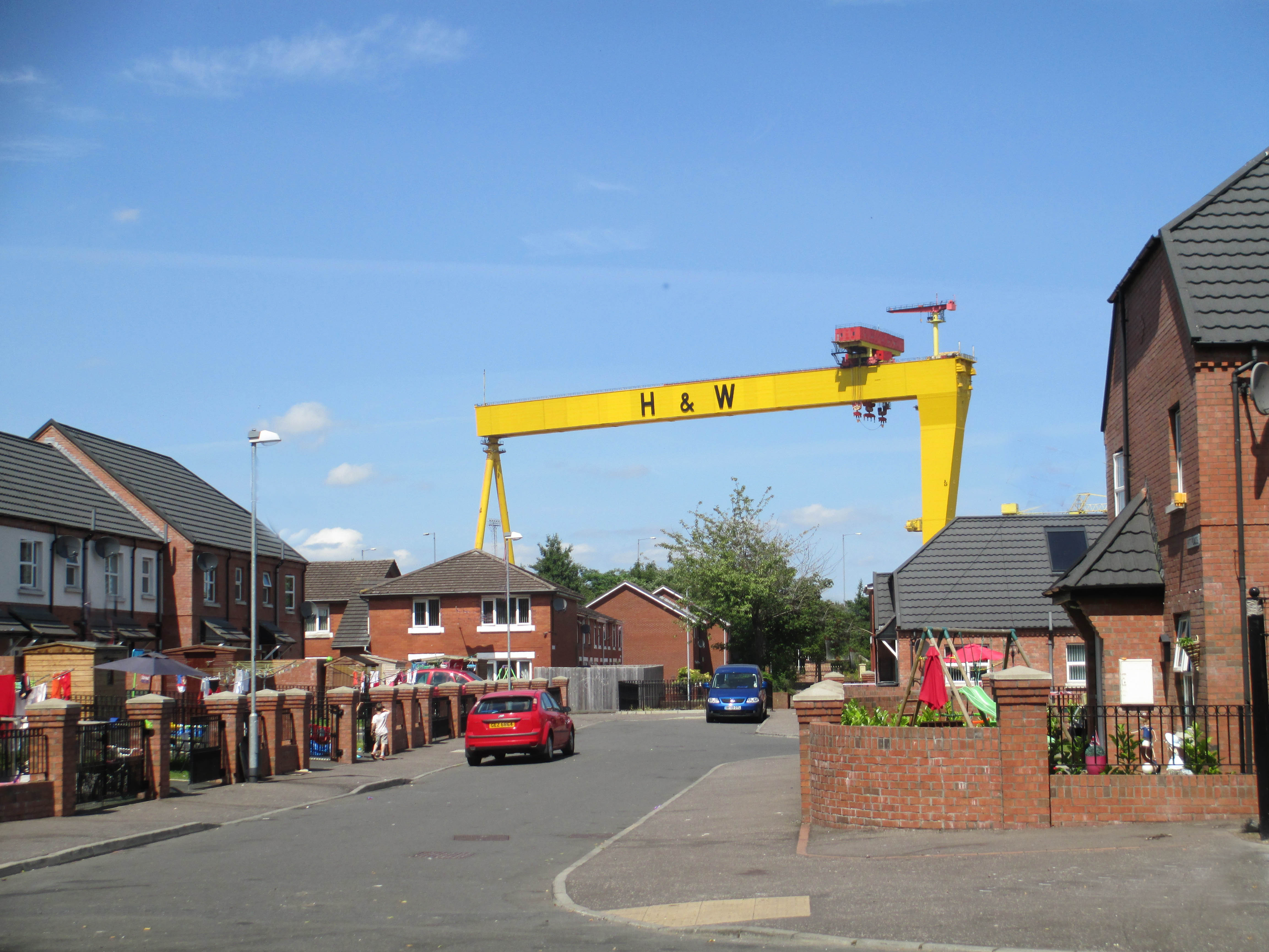
Take this image for example; the Harland & Wolff crane is a commanding structure but it could still be highlighted further.
BOOM!

This illustration was used to showcase a number of works from artists during the Modernist movement. Instead of just plonking the images on the page (or screen) in the usual ‘flat’ manner, I decided to ‘hang’ them on a wall and used various techniques to add shading and lighting to give the effect that they were being illuminated – quite like an art gallery. Then I used a brush effect as the background for the text below (so that it looked like an artist had painted across the page). It’s no longer a one dimensional illustration; it has a little depth.

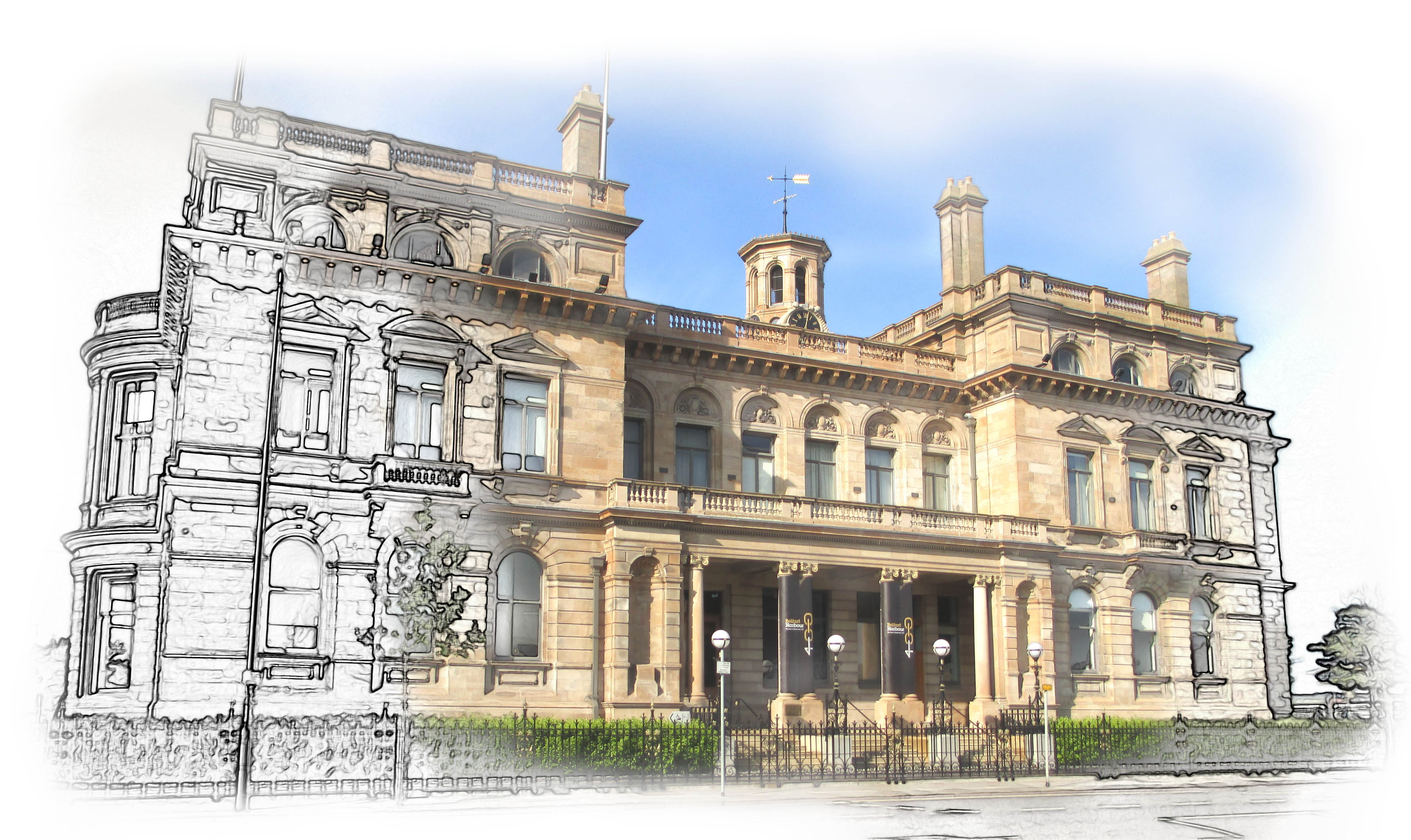
This image will form the front cover of the report I’m currently working on. It blends a sketched effect with a photo to inject a little bit of creativity. I like it a lot; it has a whimsical feel about it.
 .
.
Sometimes you don’t need to use Photoshop or GIMP at all. I used PowerPoint to create the effect below. It’s taking inspiration from the work of artist Piet Mondrian. I literally drew a few lines; edited their thickness, inserted a few rectangles and then filled them with black.

As I said; the only limitation is your imagination!


3 Comments
Really like the building with the sketched effect – very creative.
LikeLike
Very cool!
LikeLike
Thanks Peeps!! 🙂
LikeLike