Christmas Interiors: Urban Style!
We all know that I have a preference for contemporary, urban design when it comes to interiors and due to its versatility, there’s no reason why this style can’t be extended to this festive time of year.
I’ve decided to ditch the more traditional trappings of Christmas decor for a much more rugged and edgy aesthetic but don’t fret, there’s plenty of sparkle, greenery and sumptuous texture to ensure that the riches of festive styling are still intact!
Are you ready to take a little trip to the dark side this Christmas?!
It’s ok, you’re in safe hands, I’ll guide you every step of the way.

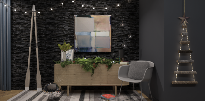
So without further ado, here’s my design in all its lush, edgy and unconventional glory! I’m 100% sure that you’ll want to click on this image to fully appreciate all the various design elements of this interior!
My starting point for this design scheme was that kooky ‘alternative’ Christmas tree. It’s so blinkin simple but soooo effective AND it’s perfect for any room in your house. Hallways, awkward corners, or small spaces: this tree WILL perform! The addition of fairy lights transforms it into a whimsical little wonder and the copper star? LOVE! And let’s not forget the rustic charm of the rope! Grab the rope ladder tree at Rocket St. George and a copper star at Etsy!
I decided that this space was going to be dark, dark, dark! Why? Because it adds a sense of drama, and mystic splendour! Plus, dark hues soften the urban, contemporary design elements and enriches the overall tone. AND dark colours provide a sublime backdrop for metallics. For this space, I’ve used Farrow and Ball, Railings (corner walls).
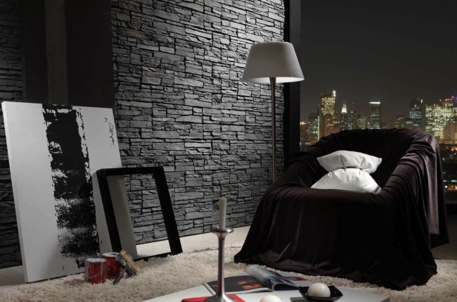
To add even MORE richness I’ve included the MOTHER of all statement walls: SLATE! This is without a doubt the strongest design element in this room. It’s downright sexy!
Yes, I said SEXY.
It dominates the room with its lush textures and moody dark tones and is highlighted to perfection with the lighting. This wall BEGS you to touch it! London Stone has a nice range and if you’re from Northern Ireland, Haldane Fisher can hook you up! However, if you’re after a quick-fix, with minimal upkeep, there’s no reason why you can’t use a good quality imitation. The peeps at Dreamwall have a good selection.
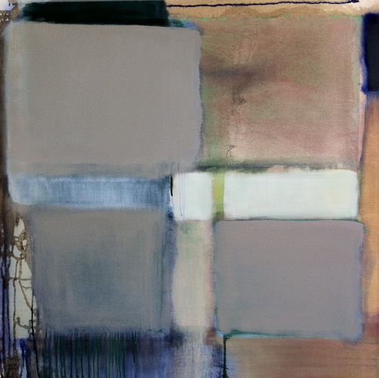
I’ve used a restrained colour palette in this space, there’s a few reasons for this. First of all, this room is texture heavy and contains many eye catching elements. We don’t want additions of colour to compete with everything else going on in this interior. I’ve taken inspiration from the piece of art for added pops of colour around the room (also adds consistency). The curtains are a similar pale blue that can be seen in the art (satin fabric to help visually lift the back wall) and the copper tones have been replicated in various accessories throughout the room (vase, baubles and star). The greenery also adds a welcome dollop of contrasting colour against the dark hue of the slate wall.
By reigning in the colour palette, the art is allowed to take centre stage, which is aided by having a dark background. I spotted this piece in Rise Art, by artist Marion Jones and was instantly drawn to the textural copper tones. It’s eye catching without being too in your face. Win-win!
Let’s talk about the oars. I saw an interior a few months ago that had oars resting against a wall and I immediately adored it. I wouldn’t consider myself an oar lover but it’s just so unexpected to see oars resting casually against a wall in this type of arrangement, so I decided to include them. If you fancy partaking in a little oar shopping, you can pick these up at Houseology – admittedly I’ve used a pale shade of wood to act as a visual contrast to the darker hues in this space.
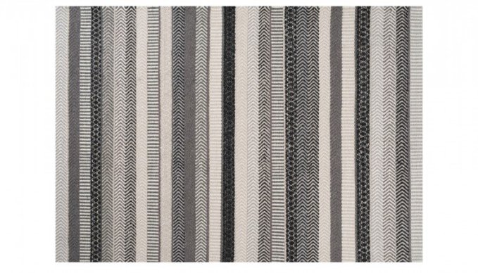
I’ve decided that rugs placed under sideboards are a winning combo. It just makes the whole arrangement much more cohesive. Yes, I’ve used the same sideboard that I included in my pink and navy design scheme (but changed it to pale wood – the beauty of CG!!). This rug adds a nice little visual treat with its subdued pattern and can be purchased at Heal’s. By the by, I’m seriously impressed with the vast range of rugs on offer from Heal’s: bravo!
Nothing says ‘party time’ more than a disco ball. It was a no brainer, it was being included in this design scheme (I love it’s retro quality too) but I decided to position it on the floor as opposed to hanging it from the ceiling; it’s a casual vibe that appeals to me. There’s more visually uplifting elements like the festoon lighting and globe candleholders that all help to soften and add warmth to this design scheme.

When I set about accessorising the sideboard, no matter how many times I arranged and rearranged, it STILL looked flat. I walked away from my laptop (as I usually do when I hit a creative wall), made a cuppa and pondered…
And then divine inspiration hit me.
A GARLAND! Ok, it’s more a garland-type-thingy. Either way, it looks cosmic! I’ve included ivy, ferns, a few twigs, tiny red flowers and chucked in some baubles for good measure.
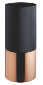
The cat picture, which was used in a previous design scheme is the work of Roo Abrook; I couldn’t resist including it. This cool picture is just too quirky for words! Finally, the copper bottomed vase is from Habitat – it’s chunky, includes copper and has a textured top section, what’s not to love?! And lastly, the gorgeous grey chair is from one of my fave Scandinavian Designers, Muuto.
So there you have it, a contemporary, urban styled Christmas interior that STILL includes all of the traditional elements of Christmas but in an unexpected way!
Got some alternative Christmas design tips? Drop ’em in the comments below!







9 Comments
Hi Anita,
Beautiful artwork – Kudos! I particularly like how the colour scheme of the painting makes it ‘pop’ off the wall – and how the bottom left corner of the painting almost-matches that of the cat picture. Nicely balanced, that.
The dappled reflections from the disco ball on the wood of the piece of furniture*. Yummy. The rug. More yummy. And I really like that there’s a patch of herringbone parquet visible as well. Classy stuff.
* what’s a piece like that called in English, anyway? A dresser? A cupboard?
By the way: hope you were off on a good ‘launch’ with your new company? Judging from the work you produce, the clients should be standing in line outside your door. :o)
LikeLiked by 1 person
Hi Erik!
Yep, that piece of art is seriously eye catching when placed in front of a dark wall. And yes, it complements the cat picture perfectly.
The disco ball is awesome! I too, love the reflections on the *sideboard*!!!
The whole scheme, whilst ever so slightly kooky, just works!
I haven’t officially ‘launched’ yet! Hopefully I’ll be doing just that in the next few weeks.
Thank you for your kind words about my work – I really appreciate it.
How’s things with your own business?
Anita
LikeLike
Sideboard… there we go. Cheers! (Live and learn = my motto :o)
I’ve been very busy with translation assignments lately, but I also have one very interesting architecture project going on the side: a couple who want to build a house here in Denmark which will consist of a large glass enclosure (with lots of ventilation, so not a greenhouse), with a ‘regular’ house built inside it. A bit like this:
http://inhabitat.com/naturhus-an-entire-house-wrapped-in-its-own-private-greenhouse/
My fingers are aching to draw the entire thing in Sketchup/Maxwell. Time; I need more time!! :o)
LikeLike
Dôh! I just realized that you actually referred to the piece of furniture as a “sideboard” in the actual post – three times! * Shuffles off to take amnesia medicine *
How does the rug-thing work, by the way: Do you ‘map’ the image of the rug on an object in your SU model – or can you actually download the rug as an importable entity – like an object from the 3D warehouse?
Cheers and good night!
LikeLike
Hi Erik,
Wow, that’s a lot of glass! I’m not completely convinced by that design but each to their own, right?! I’m sure you’ll be kept busy with that one. Are you creating the plans BY HAND??!!
The rug is an actual 3D component with the specific texture mapped onto it.
A
LikeLike
Hi again A. :o)
Thanks! I had assumed that you have been applying a ‘map’ there. The rug looks gorgeous – as does the rest of the render.
We’re in the design sketch phase with the glass house project, kicking ideas around: At this point, I actually draw floor plans (and quick elevations – plus loads of sections) by hand, in pencil, on graph paper (1/2-centimeter squares, and drawing on a 1:50 scale). It’s very old-school, but I can cover a remarkable lot of ground that way, if I do say so myself. A huge advantage of this very loose, ‘sketchy’ method is, that the client is made subconsciously aware, so to speak, that there is still a lot of room to move. The sketches are very much intended as tools for idea development.
Whenever I’m in the mood for it, I break out the black fine-liners and a dark grey marker and trace the furniture and the walls (and ‘fill’ the latter, indicating mass) to really make the drawings pop. Then, out may come the blue markers for glass surfaces and contours, and the green and brown ones for some landscape.
For this particular project, I’ve so far generated 2 floor plans, 4 elevations and 3 sections, ink-traced and colored, in just under 10 hours.
LikeLiked by 1 person
I can completely appreciate the merits of sketching for conceptual purposes. You’ve achieved loads in 10 hours!
I’m so used to SketchUp that regardless of the stage of my design, it’s my go-to. But we all have methods that work for us. If it ain’t broke!
A
LikeLike
[…] another example of one of my designs. You can clearly see that the dark backdrop amplifies the colours in the piece of art. This […]
LikeLike
[…] haven’t created a design scheme from my urban Christmas design, so I thought I’d create a Scandinavian inspired bedroom, due to its crisp and fresh vibe […]
LikeLike