That Time I Redesigned Victoria Beckham’s Office
Ok, allow me to clarify: yes, I did indeed redesign Victoria Beckham’s London office but I did it without her knowledge. You see, that’s one of the perks of being a 3D Visualiser with a background in Interior Design. You can replicate the shell of an interior via a 3D model and then BOOM, completely redesign it. I’m basically the 3D nerd equivalent to Wonder Woman, minus a bit of gold rope and super tight hot pants.

I clapped eyes on Victoria’s London office whilst channel hopping on YouTube one day. I was instantly underwhelmed and generally disappointed with its uninspiring offerings. Most importantly, I didn’t feel it reflected its successful and high profile Fashion Designer occupant.
In my mind, as a Fashion Designer, Victoria’s office should be representative of her creativity and energy. It should be visually uplifting, inspiring and command attention.
The interior below, I’m afraid, does none of the above and I HAD to do something about it. My biggest gripe about the current design is the desk. It’s HUGE and a third of it displays photographs. No one needs a desk that size! The wall-to-wall storage, combined with the biscuit coloured carpet and cream walls screams bedroom and NOT contemporary office design.

So, how did I start my design process? I researched, researched and researched some more. Basically, I’m responsible for the last 1,000 views of most of Victoria’s recent YouTube interviews, documentaries and whatever else I could get my hands on. I also took a lot of inspiration from the interior of her Dover Street shop. I guess I had to devise a client brief, minus the client. A challenge, I’m sure you’ll agree.
This is what I came up with.

I wanted to design an industrial inspired office interior, that incorporated neutrals with shots of colour AND create areas of visual interest without being too distracting. I wanted the space to reflect Victoria’s sense of style but also ensure she could still focus on the job at hand: FASHION!
Enough rambling!
Let’s take a look at my photo-real image of Victoria’s redesigned office!
Click on the image to take a closer look at the good stuff!
Then I’ll explain my design and how YOU can achieve this look!
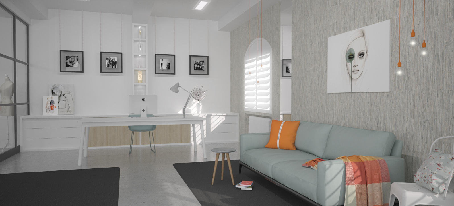
My starting point? ORANGE! But I’ve used it as an accent so that it has as much visual impact as possible.
Whilst VB has mentioned her preference for sunset orange (more red/orange) in an interview, I’ve opted for a more umm, orange/orange. It’s one of my favourite accent colours. Here’s why: orange adds a shot of warmth (particularly useful for softening industrial inspired interiors) and it’s incredibly uplifting without being too in your face.
The orange cushion is actually a lovely little nod to one of her early dress designs (which became known as her signature style). So I decided that it would be quite cool (and nostalgic) to reinvent it as a cushion. It has an exposed zip running all the way down the centre. Awesome!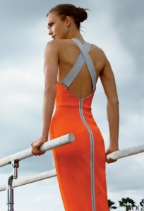
Orange has also been used in the Muuto bulb pendant lighting and throw. This style of lighting has industrial associations but any harshness is softened when used in groups. Its pop of colour also gives it a lot of presence in this space and alongside the feature wall, piece of art and sofa, THIS becomes the main focal point in this room (and not a taupe desk!). I felt it was important to inject a restrained amount of pattern in this space. Something tells me that Victoria is probably a fan of neutrals, with less focus on pattern but there’s no getting away from it:
pattern adds depth
it provides visual interest
it can help to reinforce a colour palette
and it stops a space from looking too one dimensional

Muuto Loom Throw
So I included the subtle pattern of the throw and the very delicate floral pattern illustrated on the cushion (I’ll reference that cushion later). The throw being draped along the sofa adds a casual vibe and helps to prevent the space from looking too rigid – which can happen sometimes in minimal, contemporary interiors. This is also why I positioned the side table in an off centre location in front of the sofa. It hasn’t been plonked on one side of the sofa, with a matching table on the other side.
Let’s throw caution to the wind! Let’s NOT have matching side tables in a symmetrical arrangement!
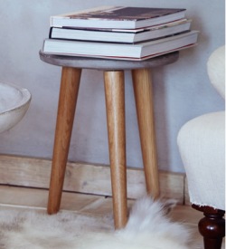
The side table, with its use of concrete further underpins the industrial look (and complements the polished concrete floor) but the wooden legs add a little warmth (and also complement the wood used in the storage unit). There’s also a vintage nod due to its design.
I flippin’ love it. It’s available at Cox and Cox.
I decided very early in the design process to use a split complementary colour scheme of orange and pale blue. This colour palette is fresh and uplifting, yes, it’s quite colourful but it has been used very liberally so as not to overpower.
Seriously, how can you NOT love this utterly gorgeous combination! The soft blue has been used on the sofa (beautiful contrast to the orange cushion and patterned throw), the floral cushion and the desk chair. It has also been highlighted in the wall art. I gotta be honest, I edited the colour of this art so that it would complement the sofa better. But we’re talking about Victoria Beckham’s office here. I’d imagine if she wanted that piece of art but with different colours, she’d make it happen.
I wanted to include art for two reasons: to soften the overall aesthetic of the space and to help reinforce her brand. Her collections are about celebrating and empowering women. So let’s hang an emotive piece of art on the wall that represents her target market, right? The art above the sofa helps draw the eye to the main focal point of the room and is very effective at adding an overtly feminine quality. It also breaks up the expanse of wall (more about that later). I was drawn to this piece as soon as I saw it. This is the work of talented Artist, Leigh Viner. You can view the original here. I’ve also used another of Leigh’s pieces in this interior. Check it out here.

This interior does have a Scandinavian influence with the use of white, pale wood, the minimal styling and clean lines but I felt the large section of wall facing the entrance to the office deserved something a little more special than white paint. This feature wallpaper does a couple of things. It adds a sense of history, it complements the colour palette and it’s just freakin’ awesome. Plus, it’s also a very subtle nod to Victoria’s musical past. This wallpaper has been designed by Arthur Slenk for NLXL and can be purchased at Rockett St. George and it’s a conversation starter.
Why?
I’m glad you asked.
This, THIS wallpaper is actually a high tech scan of a collage. A collage of handwritten music sheets that were used by an orchestra between 1872 and 1941.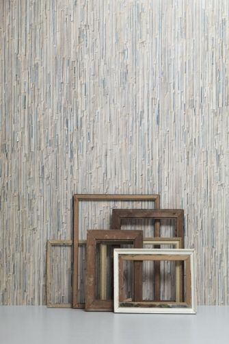
I KNOW!! How downright COSMIC! I’m getting ridiculously excited just sharing this snippet of information. I think it’s perfect for a feature wall in this space because of its uniqueness, and the neutral palette with glimpses of blue is simply majestic!
Let’s talk about the flooring. I’ve used a polished concrete floor, similar to the flooring at Dover Street but I’ve also added two area rugs. These rugs in charcoal grey help to add weight to the overall design. But they also do something else. They create the illusion of a runway. I noticed in the interview I referenced earlier, that Victoria scrutinised her designs while models walked up and down her office. So I thought it would be cool to create a runway type design. These area rugs would go right up to the wall opposite the desk for maximum impact.
If I were to provide you with a lovely, whimsical illustration of this design concept, it would look something like this.
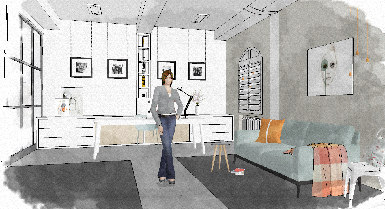
Next up is the other focal point of this room and that’s the art gallery inspired wall. From a practical point of view, I don’t feel a desk should be cluttered with photo frames. That’s just my humble opinion (sorry VB!). Plus, it’s not a very eye catching way to display your prized images. I took inspiration from Dover Street for this particular design. The clothes in this store hang on suspended silver chains. So I felt it would be very fitting to hang VB’s cherished images from chains suspended from the ceiling (also helps to draw the eye UP). These photo frames sit a few inches from the wall, which adds depth and casts interesting shadows. Considering Victoria is so family orientated, it was important that images of her family were showcased in this design. If you look closely, I’ve used real images. Awwww…
Victoria’s success in the Fashion industry has been well documented and as a result of her achievements, she has won quite a few awards. These little fellas should be allowed to shine. Oh yes! So I’ve created an illuminated section of box shelving to do just that!
You may have noticed that the imposing wall-to-wall dark wooden storage has been replaced with a much more refined and modern solution. I’ve decided that the drawers are ‘push’ operated and the centre cupboard doors slide to each side for instant access. The little glimpse of light wood is a very nice touch. It breaks up the use of white and adds a welcome touch of warmth. This general area has been kept fairly low key, so as not to compete too much with the sofa wall (desk by Muuto). I’ve added a little bit of art (casually leaning against the wall) which includes a sketch of one of Victoria’s collections by an awesome illustrator, Caroline Andrieu. I looked for genuine sketches from Victoria’s camp but couldn’t find any, which is a shame but hey, it’s no biggie.
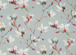
This is probably my longest ever blog post. I’m starting to wane but we’re almost at the finish line. Only two more elements of this design to discuss and then we’re done! To help break up the expanse of wall where the sofa is located, I decided to include a slick of mirror. This is wide enough to provide a glimpse of your reflection as you walk past. It also goes from floor to ceiling, which helps to reinforce a feeling of height to the room. And lastly, I’ve included a white Tolix chair beside the sofa. The splash of white is very fresh. The floral fabric on the cushion helps to pull together the colour palette (Romo) but really, I just love combining the softness of florals with industrial design elements – it’s a cool contrast.
I hope you enjoyed my redesign of Victoria’s office and my design rationale. I would love to hear your thoughts on this design scheme. Drop some comments below! Go, go, go!
![]()
SERVICES THE 3D PROCESS CONTACT


12 Comments
great design, use of space works well.
LikeLiked by 1 person
Helen, thank you for taking the time to comment! And thanks for your positive feedback. I’m thrilled that you like it 🙂
LikeLike
Lovely feminin design …. ofcourse mrs. Victoria like it
LikeLiked by 1 person
Thank you Arief! I’m glad you like it!
LikeLike
Beautiful colours, I love the theme and the space planning. Well done. What software do you use if I may ask?
LikeLiked by 1 person
Hi Mary, thank you for dropping by! And thanks for your awesome feedback – I love the colour palette too 🙂 I use SketchUp and Maxwell Render.
LikeLike
Very good design and Beautiful colours
LikeLike
Thanks! I love the colour palette, it’s so fresh 🙂
LikeLike
Good approach. VB would love what you have done. Gluck.
LikeLiked by 1 person
Thanks! I’m thrilled that you like it. I can only dream that VB sees it!
LikeLike
Really nice design scheme!!! It looks really great and soooo much better than the office of VB (sorry VB!).
🙂 🙂 🙂
LikeLiked by 1 person
Thank you! So delighted that you like it 🙂
LikeLike