A Blush State of Mind
I haven’t been a huge follower of the current blush pink interior design trend, I’m not really a blush pink kinda gal. Actually, pastels in general aren’t my ‘thing’.
But the universe has been giving me signs.
And it’s been bloody persistent.
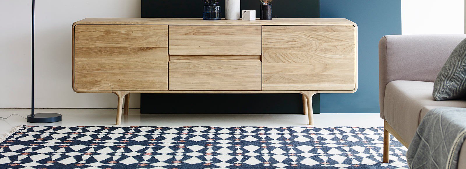
It all started when I clapped eyes on this sideboard from Marks & Spencer.

I was instantly drawn to the richness of the midnight blue colour and the contrasting copper detailing. I really, REALLY loved it. Coincidentally, the peeps at M&S have suggested that this sideboard is, erm, black!! I’ve studied this sideboard (you’ll find out why later in this post). It ain’t black!! It clearly has blue undertones. It’s CLEARLY midnight BLUE! Sheesh!! You’re probably wondering what this sideboard has to do with pink but keep reading…
Fast forward a few months, I was minding my own business, doing a little online cushion browsing (all part ‘n’ parcel of my unhealthy cushion obsession), when I spotted THIS!

I was instantly smitten with the navy and pink colour palette. Even though I’m not a fan of pink, I felt this colour palette was insanely glorious.
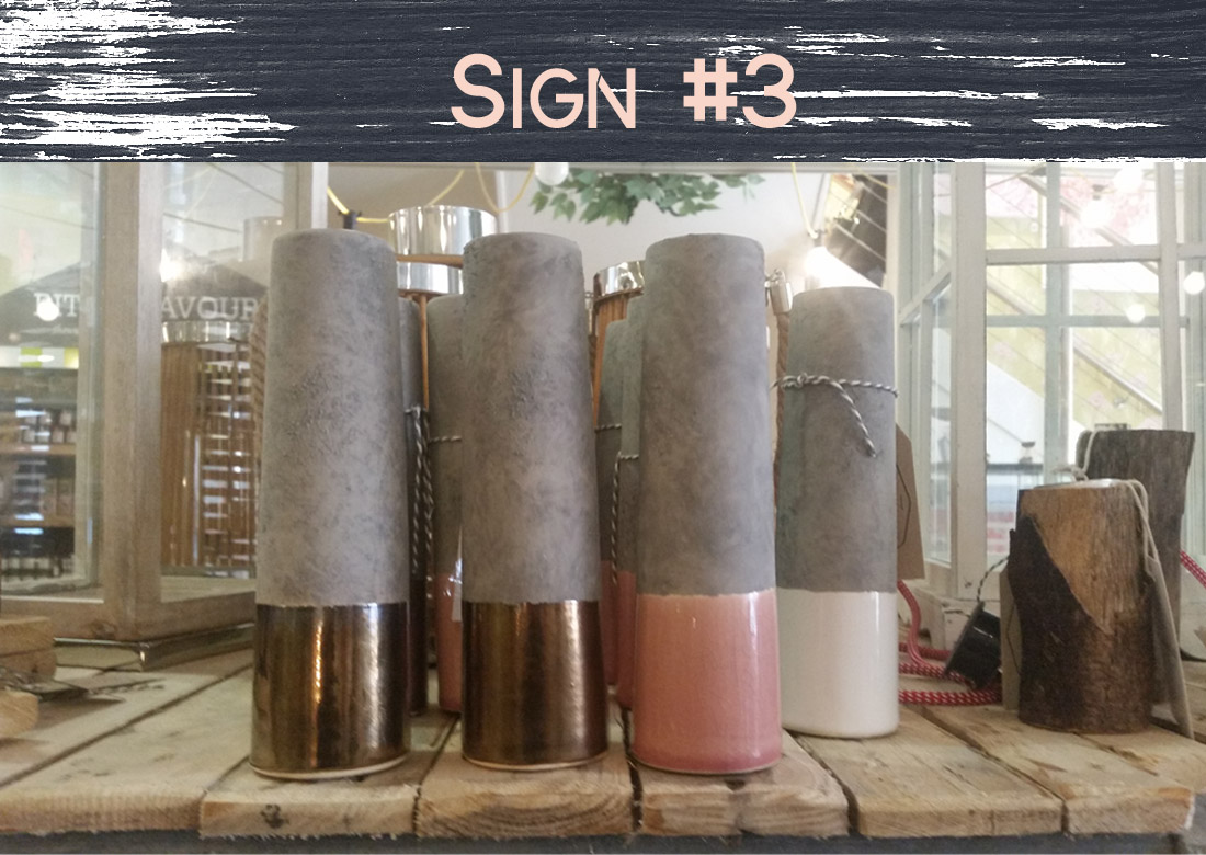
THEN, as I was innocently walking around a shop in my lunch hour a few weeks ago, I spotted THESE. My favourite? Strangely (and extremely uncharacteristically), it was the pink one. And I know EXACTLY why: the sharp contrast between the edgy concrete finish and soft, whimsical shade of pink. It’s unexpected but it sooo works.
I decided that all of the above were cosmic signs. Feeling inspired with my newfangled appreciation for pink (teamed with navy), I challenged myself to create a design scheme centred around the blush and navy colour palette. I didn’t want to create another purely urban, industrial inspired space.
GULP.
I wanted to create a more glam, softer aesthetic. If you read my blog, you’ll know that this is not my usual scene.
I needed to prepare myself for this.
Emotionally
Physically
And mentally
My preparation was simple.
I bought Elle Decoration and did a bit of online detective work.
And then realising the enormity of the task ahead, I did a few of these.

After my twentieth third push-up, and a few neck rolls, I dabbed my brow and set to work.
I wanted to replicate that awesome, effortlessly chic ‘interior mag’ shot (which is actually ANYTHING but effortless!!), so I’ve kept this interior fairly simple but hopefully you’ll see just how freakin’ awesome this colour palette and softer vibe can look in an interior.
Let’s take a look at the good stuff!

This little design scheme has it all: colour, pattern, metallics, wood and it all works! Yes, I sound mildly surprised myself! The consistency of the colour palette is the obvious reason (although I chucked in a little bit of soft green to break things up).
Where do I start explaining my design rationale?? WHERE??!!
Ok, the starting point was the Marks & Spencer sideboard, I spotted the pink (anniversary edition) Fritz Hansen Series 7 chair while casually flicking through Elle Decoration and decided it would be a perfect addition.

Fritz Hansen Series 7
I knew that I wanted statement art above the sideboard, so I automatically went straight to my ‘go to’, Jessica Zoob.
She didn’t let me down.
This piece of art not only draws out the depth of tone of the sideboard but it also includes glimpses of blush pink. Hurrah! Plus, it adds a little bit of ‘crazy’ to a rather constrained design scheme.

Cole & Son Wallpaper
I also knew early in the design process that I wanted a geometric wallpaper. I’m not sure why, I just did. After a bit of lengthy online searching I found the exact size of pattern (I wanted it to be quite large) and colourway. This wallpaper is called Labyrinth and it’s from Cole & Son. Even though it’s quite eye catching, its neutral colour palette makes it a little more forgiving.
I spotted the copper table lamp on my usual fortnightly stalking of Abigail Ahern’s website and decided that it was the right level of quirky for this design. The copper finish also fits right at home in this whole blush thing I have going on.
Let’s talk about the black and white striped vase. Actually, I don’t need to. It’s quite obviously a visual delight.
Let’s just stare at a close up for a few seconds.

Helllloooo Sailor!
These funky vases are made by House Doctor and can be purchased at House Envy.
Of course, I included the concrete/pink vase that I referenced earlier, which is sold at Ruby Roost and added a fab copper candle holder, which is available from Habitat. 
The neon sign was a moment of madness that seems to have paid off. It underpins the glam quality of this design and I think the overall scheme would be sorely lacking without it. You can pick up similar at Graham and Green.
I included a few simple touches courtesy of Muuto, in the form of box shelving (the wooden finish helps to draw out the wooden legs on the sideboard, while the white one with the green back complements the Muuto storage box). I included the storage box to add a little visual depth to the photo (one of those ‘interiors mag’ tricks) and then chucked in hot pink floral (contrast to the blush pink). The cushion is from Made.com – I loved the combination of hues the minute I saw it but unfortunately that exact colour way isn’t stocked by Made.com at the minute. Apparently you have to vote or something to get it back on the shelves. What a travesty! So, if you like it, get your friends/cat/neighbours to do the decent thing and get voting!
The rug was a last minute decision. I decided that the bare parquet flooring wasn’t cutting it. The second I included the rug, it dramatically changed the whole design. It adds visual weight and pulls together the pink and navy colours used elsewhere. It’s available from Heals.
I hope you like my pink and navy design scheme and are inspired to inject a little bit of blush into your own pad!


2 Comments
I, on the other hand love pink and wish more people did so I could use it in more designs :-). Love the pink chair, especially with the gold legs. Glorious. Thanks for embracing pink.
LikeLiked by 1 person
Hey there! I definitely have a new appreciation for pink, especially when teamed with navy! That chair is pretty special, right?! And thank YOU for taking the time to comment! 🙂
LikeLike