I’m A Fan of Space But This Is Ridiculous
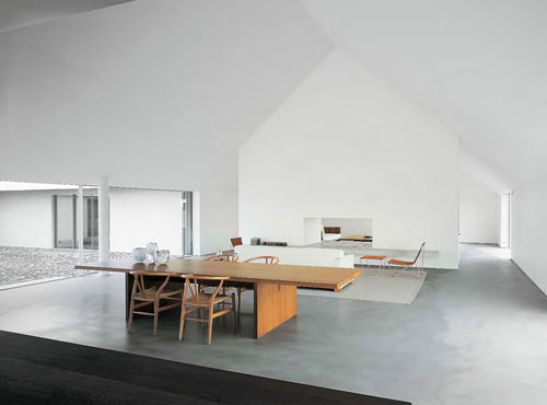
So, I’ve heard a lot of noise about this John Pawson fellow. An Architect and Interior Designer, he is a devotee of simplicity and embracing a feeling of space. The below image is from his work at Baron House, Sweden. I’m sorry. I’ve tried. I don’t like it. High ceilings? Fantastic; love them. Neutral colour schemes? Bring it on. Simple lines? Yes please. But this ‘space’ is just that: SPACE. To me it is completely lacking in personality, texture, colour, pattern and LIFE!! Even a focal point to help draw the eye to something! Where is the actual utilisation of space?
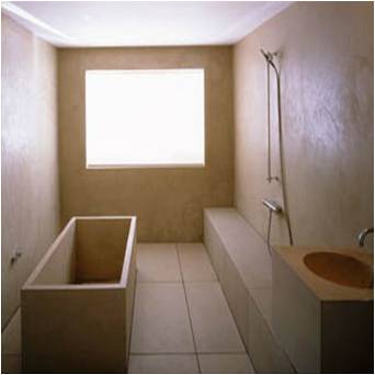
This is ‘Pawson House’, London 1994: I cannot for the life of me imagine anyone who would feel serene, calm and rejuvenated after a soak in this tub! To me, the utilisation of this space amounts to a room that resembles a large box, that has fitted furniture which resemble smaller boxes. Lots of sharp edges, harsh natural lighting and a corridor effect by having a rectangular bath situated parallel to another rectangular object. Very unappealing in my eyes.
By way of sharp contrast the Banq restaurant is a space that has completely disguised the straight edges of its dimensions by embracing more fluid, organic shapes. The large proportions of this room have been blended into a much more intimate and dramatic space; with heavy use of wood throughout helping to bring a sense of warmth and a very inviting atmospheric quality.


4 Comments
Reblogged this on KOTHEA The Fabric Blog and commented:
Yes I agree. He probably sleeps on a tatami mat (which he rolls up during the day). AND I bet he has a bad back. It’s one of those “Looks nice but…”
LikeLike
Thanks for your comment!! There are actual people out there reading my ‘stuff’!! I was being a little brave in doing this critique because a lot of people would find it easier to just nod in agreement at how ‘astounding’ and ‘inspirational’ these spaces truly are because it’s John Pawson….and how difficult it is to actually design a minimalist space. But I just cannot like these rooms. And I’ve tried so hard!
LikeLike
The only bit I actually do like, is the pic at the bottom, where the ceiling and walls look a bit like waves, but other than that, I totally agree with you Anita, but you know that anyway!! xx
LikeLike
Hello my darling!! Thanks for dropping by 😉 Yep, that bottom image is cool and a little surreal! Great use of texture too!! xx
LikeLike