Boutique-Hotel Chic
The rich contrast of a neutral palette with earthy tones, in conjunction with glamorous silks and metallics, punctuated with statement pieces can only mean one thing: Boutique-Hotel Chic.
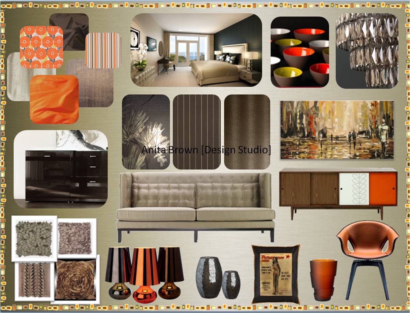
This style of interior design is sleek, polished and showcases glamour, luxury and contemporary design to great effect. But why should it be restricted to Boutique Hotels?! Heck, we all deserve a little luxury! I have provided my take on this style but with a quirky twist: RETRO baby!! The inclusion of quirky/retro pieces is made all the more possible because of the great contrast they provide to the more streamlined, modern look (as long as the contemporary and quirky are of high quality within their own right). So, not only have I included retro-inspired items, but I have also introduced the colour orange to help break up the earthy tones and further underpin the retro vibe (the colour orange has strong retro connotations). This colour palette is about sleek and soothing minks, rich chocolates, and a refreshing splash of orange for an individual and quirky look.
I wanted to create a little drama by adding a feature wallcovering – I took my lead from the dark wooden legs of the sofa and decided that one feature wall in a brown earthy shade with metallic detailing (the remaining walls would be a neutral, shade) would not only highlight the champagne shade of the sofa but would underpin the feeling of glamour because of its metallic properties. I have provided three different designs that all utilise a metallic finish without being too dominating and include designs by Charles Newhaven and Harlequin. With regards to flooring, both a dark stained wooden floor possibly adorned with a textured rug or luxurious carpet in honey/biscuit tones would work well in this space.

My colour palette consisted of neutrals, champagne and brown; I felt a striking accent colour was required to add interest and to introduce the ‘retro’ influence; I therefore chose orange. This colour comes to life when paired with mink and brown shades. I favoured Dupion silk for the fabric selections because of its texture and glamorous sheen and in addition to orange, I also chose mocha, chocolate and mink shades. I added a subtle stripe (Harlequin) that incorporated all of the main colours within this scheme to help co-ordinate and visually ‘pull’ the look together. To add a little bit of a retro feel I included the orange flower design (also Harlequin). The stripe and flower design could be used to great effect as cushion material and could easily sit side by side because they are utilising a similar colour palette.

With regards to cushions, and depending on the personal preferences of the client, I have included cushions in neutral shades that make great use of texture to add visual interest. To appeal to the client’s liking of quirky pieces, I have also included an Andrew Martin ‘Hollywood Glamour’ cushion. This cushion is imprinted with the front cover of a 1957 edition of ‘Picturegoer’ magazine, and as luck would have it, also incorporates the colour orange. Not only is it quirky, but it also has a fantastic retro vibe, and would provide relief from a scheme feeling too constrained. 
With regards to furniture I have chosen two very different looks for the ‘client’ to consider. On one hand a chocolate glossy sideboard reflects the client’s likes of contemporary design, which would probably be the safer choice, but I have also included the option of a modern retro piece by Orla Kiely Rowan. Both of these pieces would work well in this eclectic space, though I feel the Orla Kiely Rowan sideboard draws out the orange highlights within the modern art effectively, and acts as a great contrast to this modern painting. I also chose this style of art because it’s a modern interpretation of a cityscape, and considering the client prefers a more cosmopolitan style, this may be very appealing (and compliments the colour palette perfectly).

The modern chair is an excellent statement piece and contrasts effectively with the straight lines of the sofa. This Roberto Lazzeroni ‘Ginger’ chair is made of soft leather (brown on the outside) and has a retro inspired feel because of its round form and colour.
And finally, I have decided to take the plunge to showcase an actual interior that I have designed which includes the colour palette of chocolate, mink and orange. This makes a refreshing change from posting ‘virtual’ images!! This interior was also featured in ‘My Home’ magazine 🙂


Start the Conversation!