Grey + Yellow = The Perfect Combination

My colour palette for a contemporary colour scheme consisted of 3 different shades of grey (with the lightest shade being the dominant colour), a vibrant and strong shade of yellow, and a small amount of black. I have illustrated this colour palette in the image below – the colours have been displayed in various sizes proportionate to how they would be used in an interior.

With regards to psychological impact, I intentionally chose shades of grey that are considered ‘warmer’ (i.e. that lack blue tones) because of the negative associations that grey can conjure up, for example emotionless, dull and depressing. By the same token the positive implication of grey is a sense of independence/uniformity, and the fact that these muted colours provide a fantastic backdrop for accent colours cannot be ignored – particularly within a contemporary colour palette. My decision to use this particular palette (grey with yellow) was further influenced by the fact that this pairing is witnessed in nature.

The image above is actually a picture of moss as it appears on a rock – a truly refreshing display. Unquestionably the addition of yellow within this colour palette does much to reduce the overall cool effect of grey, and adds pockets of warmth and an overall sense of fun and energy to the visual effect. The fact that grey has been used as the predominant colour enhances the vibrancy of the yellow shade and therefore draws attention to it. The addition of a section of wall adorning one of the patterned wallcoverings would add interest and prevent the overall use of grey from appearing visually ‘flat’. The pebble rug would also add texture and interest, again to visually ‘lift’ the overall look.

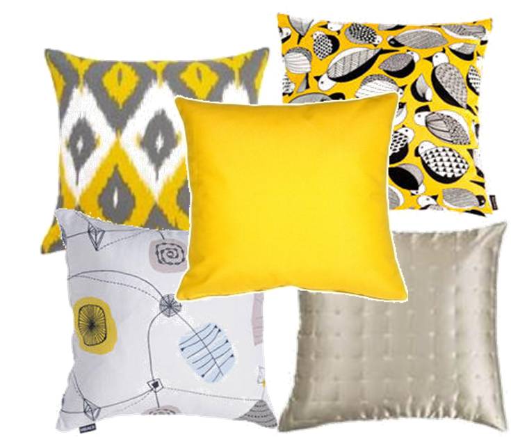
There is no question that the mid-century styled chair does a lot to help exude a bright, cheery and warm element – not only because of the choice of colour but the light-hearted pattern of flowers that it displays. The same can be said for the interesting, brightly patterned cushions, where yellow is used heavily. I have deliberately chosen silk fabrics to soften and add a sense of luxury to this colour palette also. The punctuations of black add to the contemporary styling and visually striking contrast with grey and yellow.

This is an overall strong, vibrant and fun colour scheme that combines cool and warm tones in a considered manner and therefore would encourage an invigorated, visually stimulating and emotionally up-lifting psychological response.
With regards to the perception of space, I have used the light shade of grey as the predominant tone to ensure the dimensions of a room aren’t compromised. The wallcoverings should only be used on specific sections of wall because of their mixture of light/slightly darker grey shades/pattern to also ensure that the perceived dimensions of a room are kept as spacious and streamlined as possible. However the striped wallcovering could be used vertically to help bring a sense of height to a space, or displayed horizontally to create the illusion that a space is actually longer than it is in reality. All-in-all, the light tone of grey will help to open up a space and in a room of larger proportions the patterned wallcoverings could be used to a greater extent to prevent the space from feeling too expanse/void of visual interest. The considered use of lighting must be explored depending on the aspect of the space and how much natural light is available – this will undoubtedly help to reinforce and heighten the feeling of warmth exuded from the injection of yellow in this scheme.


Start the Conversation!