How to Create Industrial Styling In 3 Hours
I decided a few weeks ago that I needed a project. Something to get my teeth into instead of all this damned theory because of my interior design studies. When my cherished Tolix chair arrived last week I couldn’t help but focus my attention on the much needed overhaul of my bookcase.
It was purchased from IKEA and whilst I like to sing IKEA’s praises; when my Tolix was perched beside it; there was obvious tension and awkwardness: they did not see eye-to-eye. At all.
Initially I was going to keep the bookcase its original dark brown shade and apply a kooky wallpaper to the back panel. But once I witnessed the strained relations between the Tolix chair and the bookcase I knew I had only one option: yep, it was time to investigate DIY industrial styling in the form of Annie Sloan Chalk Paint.

Allow me to introduce you to Annie Sloan Chalk Paint. I must point out that before I attempted my mini makeover today, I had never used Annie Sloan Chalk Paint previously. I knew very little about this range of paint and before I set about slapping paint onto my bookcase I did a little detective work.
If you’re feeling inspired by this blog post and would like to undertake a little bit of overhauling in your own home; then you should definitely check out her website. There are also loads of YouTube tutorials that take you through the entire process.
Now, I should probably explain that ASCP (I’m using this abbreviation for Annie Sloan Chalk Paint – you don’t expect me to type the full name all the way through this post, do you??!!) is a very matt and as the name suggests ‘chalky’ paint that is perfect for creating a period/vintage/aged/distressed/industrial style to furniture (or walls and floors).
The very nature of this paint means that no priming is required.
Awesome.
No prep is required.
Double awesome.
And it’s water based, which means you can wash out your brushes very easily with soapy water and your hands won’t have specks of paint stuck to them for days to come.
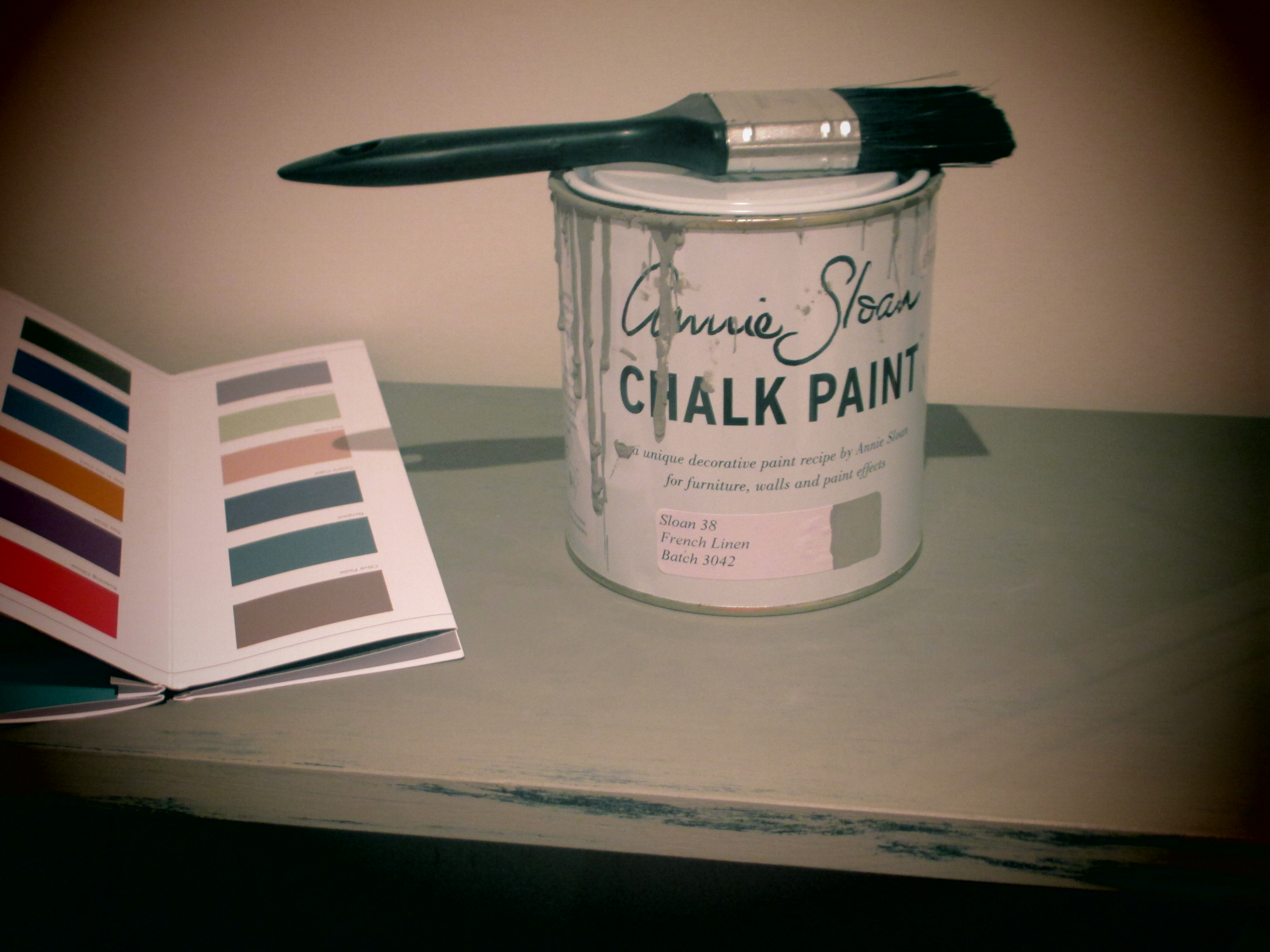
I didn’t intentionally paint streaks on this can of paint. This was a coincidence. I’m telling the truth!!
So basically I gave the bookcase a quick wipe with a damp cloth and I literally got stuck in. I slapped the paint on, and because I wanted a distressed and industrial look, I only applied one coat and intentionally left certain areas ‘blotchy’ to give the impression that this bookcase had seen better days.
This paint dries in super quick time (another massive selling point) and within 30 minutes I was able to apply the clear wax. This wax acts as a sealant and gives the finish a little more of a sheen. You can apply as many coats of wax as you like and then buff it to emphasise the sheen but because I’m going for an aged look I was happy to keep it quite matt.
I should stress that the wax quite dramatically deepens the paint colour initially applied. I’ve attached a photo to illustrate.

******Update******
Not only is Annie Sloan a very inspiring lady because of her fantastic Annie Sloan Chalk Paint, but nothing gets past this woman!! She contacted me via Twitter regarding my photo above illustrating the difference pre and post wax application. To my shame, I didn’t actually use the Annie Sloan clear wax; I used a different branded clear wax and therein lies the problem (as to why the resulting shade was quite a bit darker once the wax was applied). The moral to this story is simple: use Annie Sloan products only!!
And here’s an arty close-up. You want character? Hey presto!

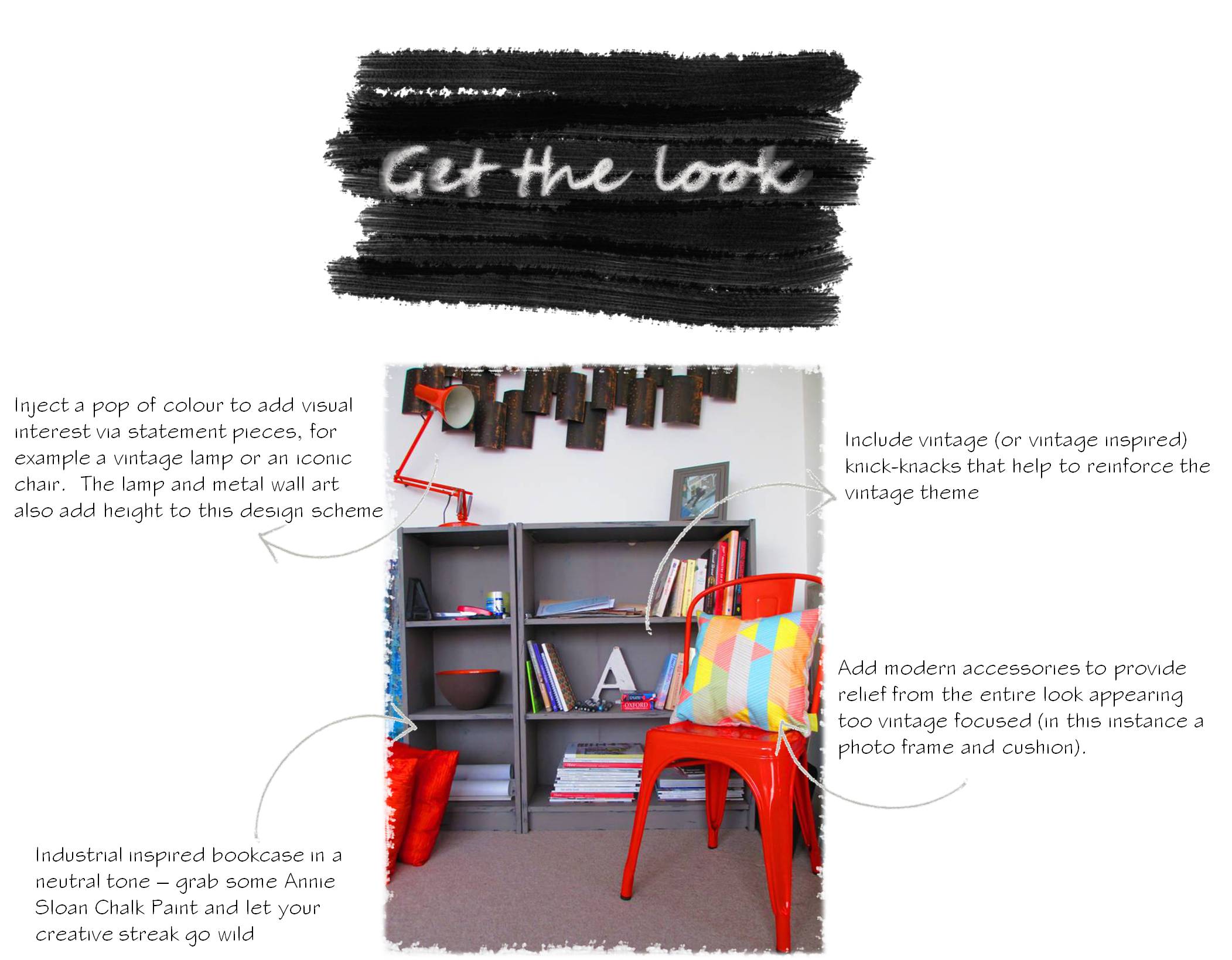
I accessorised a little and included a fantastic bowl (that I already had); it has an unglazed brown exterior and a bright orange glazed interior and I also came across a fab vintage letter A (it would appear that I’m now slightly obsessed with the letter A) just to further underpin the industrial vibe.

People would automatically assume that the original colour of the bookcase (dark brown) would highlight the colour of the Tolix chair much more successfully, but I disagree. The dark taupe shading of the ASCP and its aged effect creates much better atmospheric qualities and is a much more complimentary backdrop for the Tolix chair.
And yes, the fabric you see folded on the Tolix chair is the vintage French fabric that I purchased recently. I just haven’t had a chance to find a cushion-cover-maker-person to transform it into a cushion cover for me (if anyone from the Belfast area is reading this and can knock up a quick cushion cover please contact me)! Sometimes the colouring of the bookcase appears quite grey in photographs but it actually has very obvious brown undertones.
Annie Sloan Chalk Paint; character in a can!!
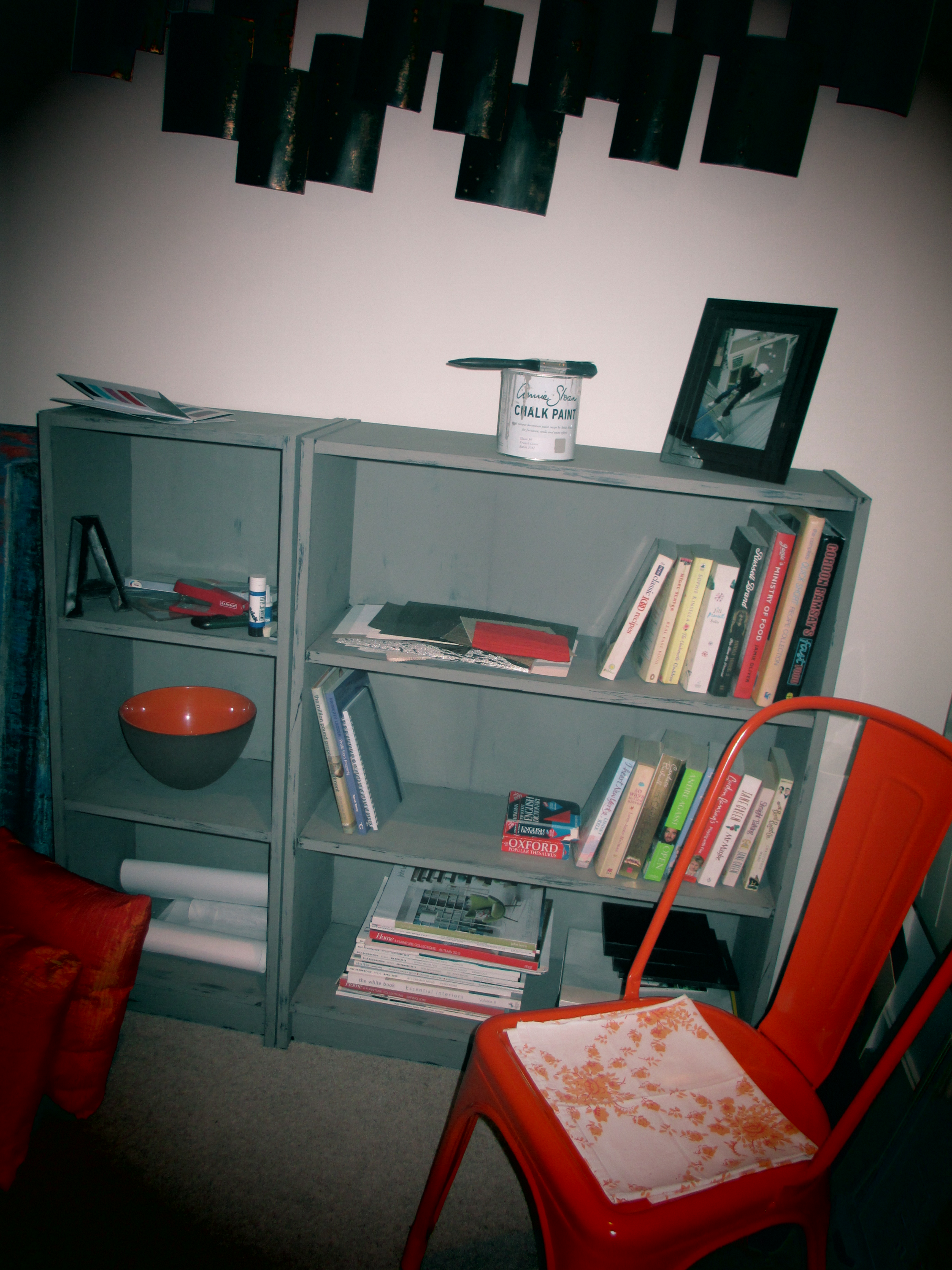
And here’s the finished design! Love, love, love!


7 Comments
The bookshelf looks awesome Anita! Great effort and I love the orange tolix chair!
LikeLike
Thanks Asma! I’m really happy with it!
LikeLike
They nicely compliment each other. Love the colour of the Tolix, but the tea stains are missing ha ha x
LikeLike
Anita,
You’re in my mindset now. Most of my stuff looks like this, but for real!!
LikeLike
Thanks Lorraine!! Tea stains??!!
Amanda, aren’t you the lucky one to have the authentic versions!! 🙂
LikeLike
So awesome!!
LikeLike
Do you really like it that much or are you just being ‘nice’ Sendek?!
LikeLike