A Little Trip to the Dark Side
Educational establishments should put a disclaimer on all of their Interior Design courses. Before I embarked on my current journey of discovery I thought I was confident in what I liked and didn’t like, and for good reason.

I was a fundamental fan of the neutrals family. Beige? Loved it. Taupe? It gave me goose bumps. Glorious shades of caramel, coffee and chocolate? Loved, loved, loved. Although I should add that usually only one wall was coated with a neutral colour whilst the remaining three were off-white. And I did inject colour; albeit limited to cushions and the odd accessory.
I can’t deny that I was highly influenced by the many property shows over the last 10 years whose mottos were to paint everything off-white in a bid to create that ‘spacious and airy’ quality (usually for resale purposes). There’s no doubt about it, off-white DOES and WILL make a room appear more spacious and provide a very ‘clean’ and uncluttered aesthetic but at what cost? Can you create drama, ambience and character using off-white?
Well, CAN you??!

Actually come to think of it my ‘design style’ prior to studying Interior Design was rather safe, understated and dare I say ‘mainstream’.
 And I’m not just talking about colour choice here. I’m also talking about pattern. In my previous life I was afraid of it. Yes…afraid. To me, there was nothing more terrifying than the thought of a FLORAL pattern. I would have preferred to stare at an 80s yellow-pine tongue and grooved ceiling than contemplate a floral cushion. Back then stripes were my best friend (and they still are) but the difference now is that I have the know-how and confidence to mix and match various patterns/textures and know that they will look damn good.
Vintage was something I sneered at and because of my lack of true understanding regarding its merits and what it brought to a design scheme, all things ‘vintage’ were completely disregarded. When I think back to this mind-set, I’m disgusted with myself. Disgusted! Because now, I do like vintage. I rejoice at its quirkiness; its uniqueness and the creativity that injections of vintage can bring to a contemporary design scheme.

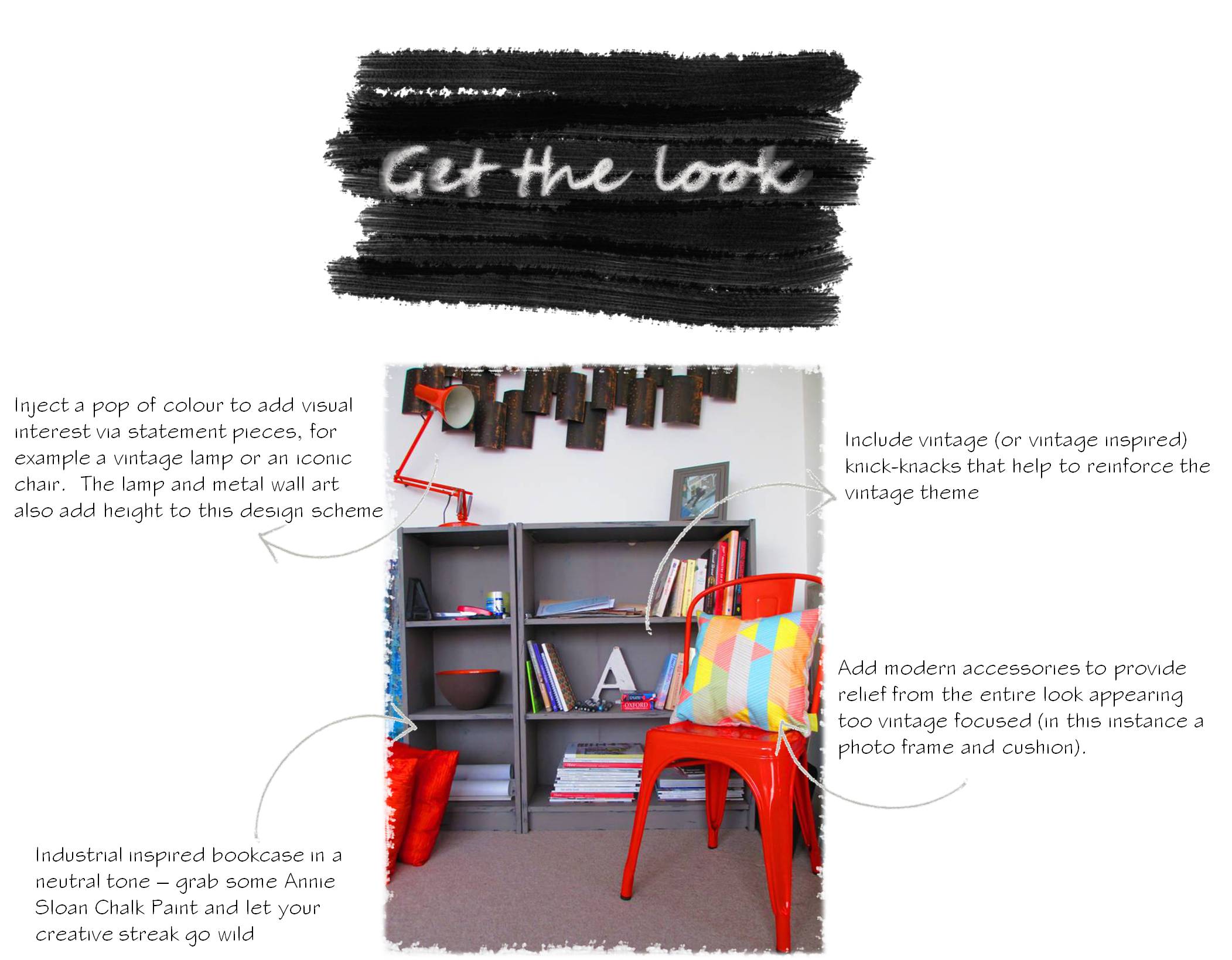
A project I undertook recently. Vintage chairs + vintage fabric is a sight to behold
Heck, before I started studying Interior Design I thought ‘Modern’ and ‘Contemporary’ were basically one and the same!!
I was clearly a fool. An uneducated fool!
What I’m trying to say is as a result of the ridiculous amount of research I’ve undertaken because of my studies I’ve had my eyes opened to various design styles and techniques that I’ve gleamed from countless books, magazines and designers. This in turn has resulted in a HUGE reassessment of my overall design preferences.
So inspired was I by Abigail Ahern’s blog, where she dishes out daily tips and words of advice, that I undertook a little project of my own. If you’ve read my blog before you’ll be extremely (and probably nauseatingly) aware of my ‘modern meets vintage’ overhaul. Yes, I rambled on quite a bit about that particular project but seriously, a vintage Anglepoise lamp, a Tolix chair and a grubby distressed bookcase??
How could I NOT??!!
I love this look. LOVE. And I’d love to redesign my entire living space to further compliment this corner of my room. But alas I’m not in a position to do that at present. BUT I did the next best thing and created a few 3D visuals to illustrate how funky the entire space could look by further adopting Abigail Ahern’s ‘dark side’ and creating a moody, atmospheric and utterly edgy NYC loft style pad.
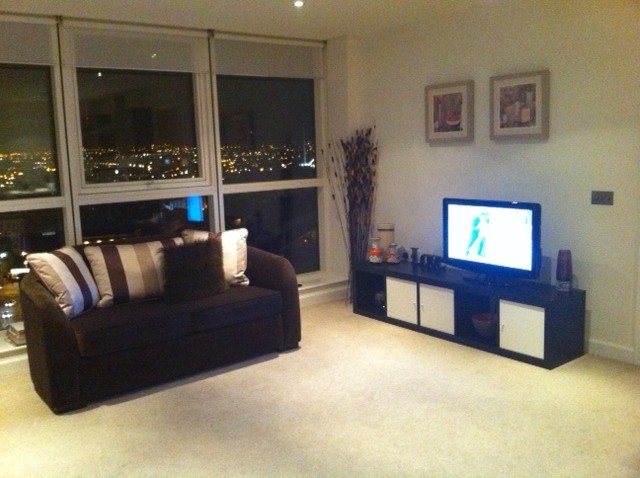
This is how my living room looks at present (not too shabby):
And this is how it could look:
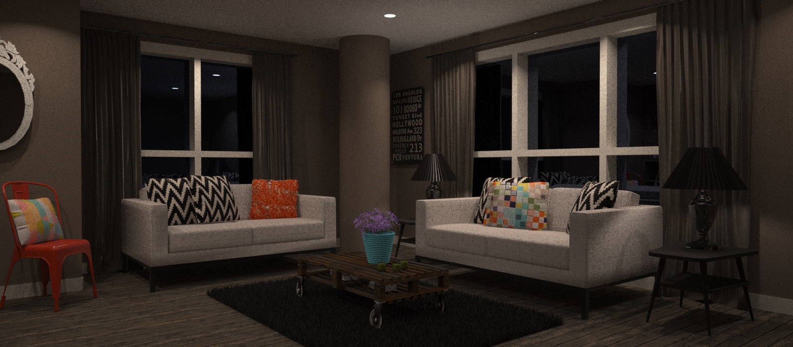
Here we have a fabulous dark clay colour that has warm undertones – this will prevent the space from appearing too cool. There’s quite a mix of design styles in this scheme. Can you spot them?
We have the Tolix; a chair from circa 1930 that has strong industrial connotations; then we have the mid-century side tables (vintage dahling) in a moody dark bitter chocolate brown; again the pallet coffee table is industrial in design and underpins that whole edgy, funky look; then the modular sofas, streamlined and unfussy in design provide a little bit of relief from the rest of the eye-candy in the room.
Softness is created with silk curtains which continue with the clay tones, thereby providing consistency and for further visual stimulation I’ve added eye-catching patterns via cushions (the zig-zag and orange cushions are sold by Abigail Ahern and the squares design is Imogen Heath) and a richly textured rug. One word: lush.
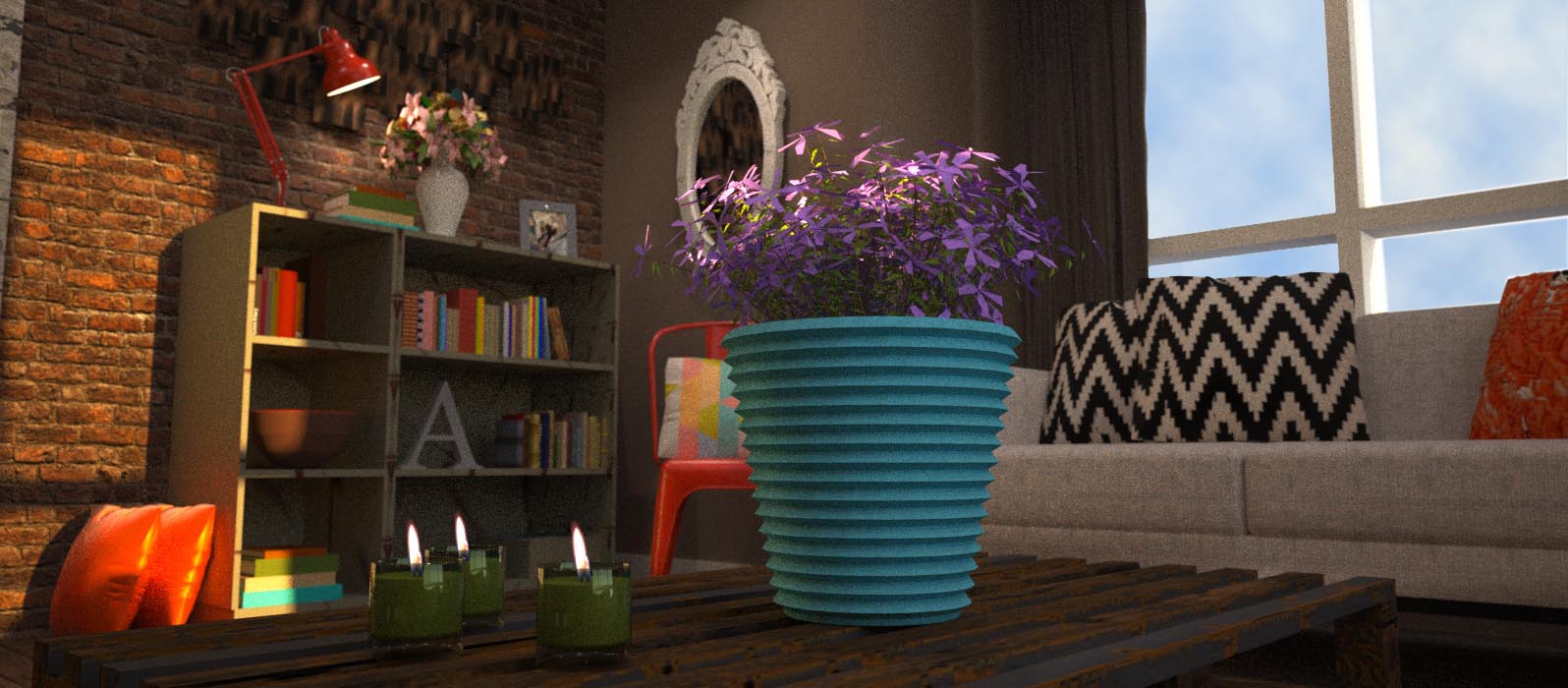
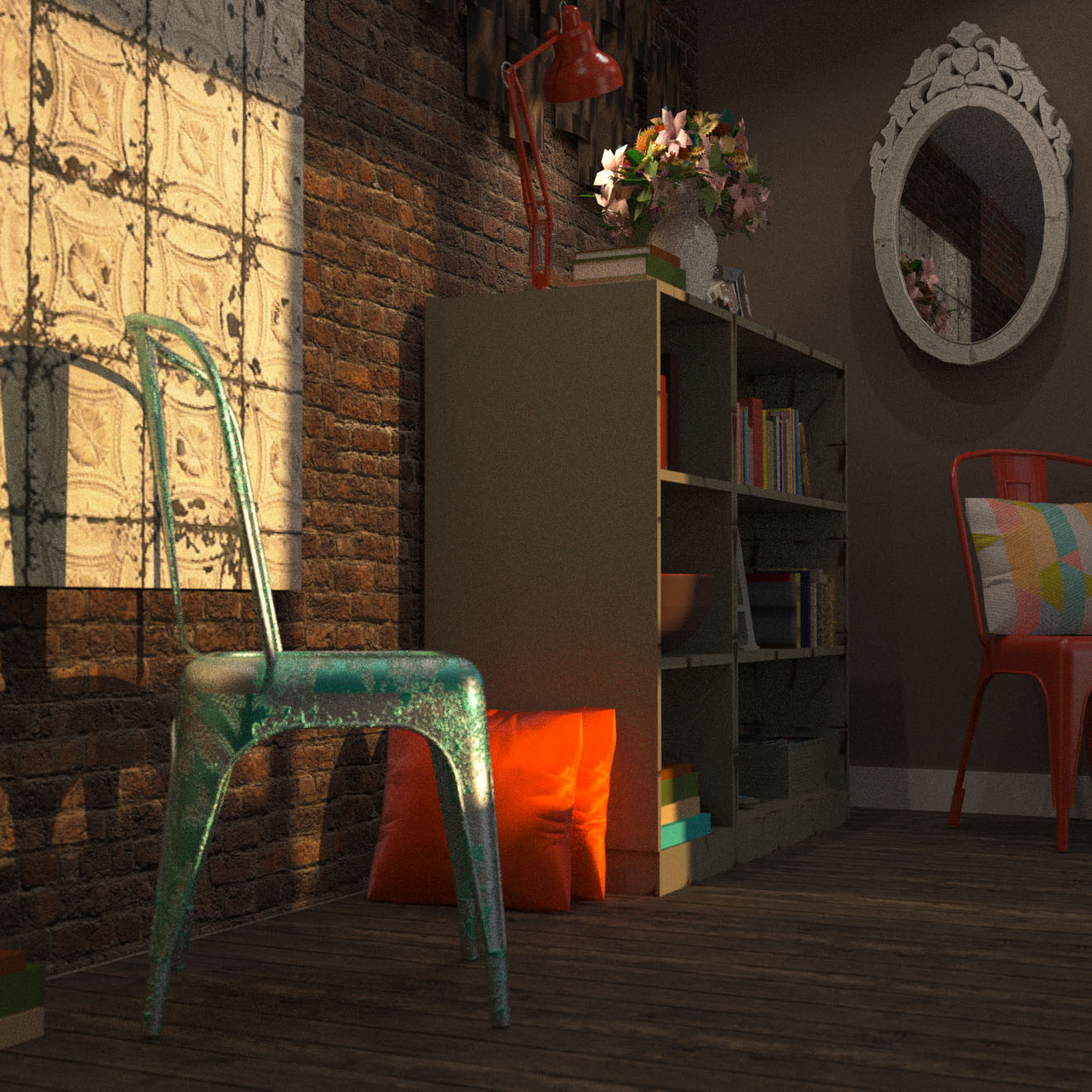
My 3D visuals wouldn’t be complete without an arty close-up, right?! The crowd-pleaser in this space is unquestionably the exposed brick wall. It anchors the room, provides a ridiculously yummy tactile quality and it DARES you to touch it! Notice how the Tolix chair really stands to attention with the clay wall colour? Awesome.

Here is the exposed brick wall in all its rustic, touchy-feely glory. Yes, I added another Tolix. These chairs are like tattoos: addictive. But I’ve included a vintage Tolix – it’s a grubby, paint-peeling hot mess (yes, you can buy original vintage Tolix chairs….they cost a fortune but are so rich in character….I WILL have one someday). I’ve also included a canvas that has been made using Abigail Ahern wallpaper (Tin Tiles).
And another obligatory arty close-up.
LOOK at that wall!!! Tell me this isn’t a beautiful sight!!


2 Comments
The arty close up is my favorite! Great color combination.
LikeLike
Awh thanks!! Glad you like it 🙂
LikeLike