Black & White – Embrace It Don’t Fear It
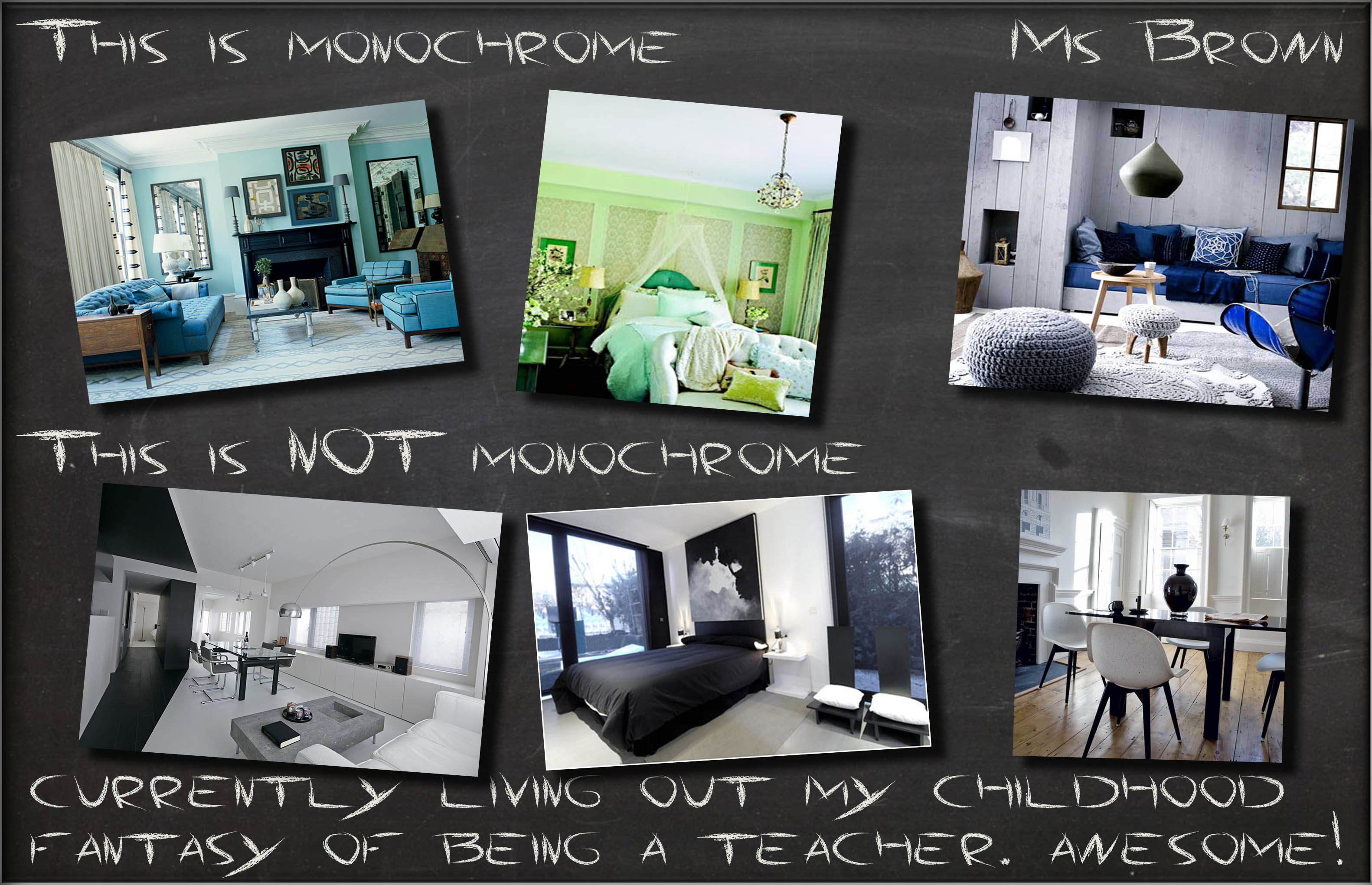
Let’s get something straight. Monochrome is a term that describes varying shades of ONE colour. It is not correct to describe a room that has been designed using a colour palette of black and white as Monochrome. Where this originated, I don’t know but it’s technically wrong, wrong, wrong!
Let’s summarise.
I recently designed a bedroom in a city centre apartment using a softer version of the above black and white colour palettes. I’ll tell you why I softened this very well known look; I find that sometimes it can be a little stark and cold. But as far as modern styling goes, black and white will always be deemed edgy, seamless and dramatic. Which is always a winner in my book.
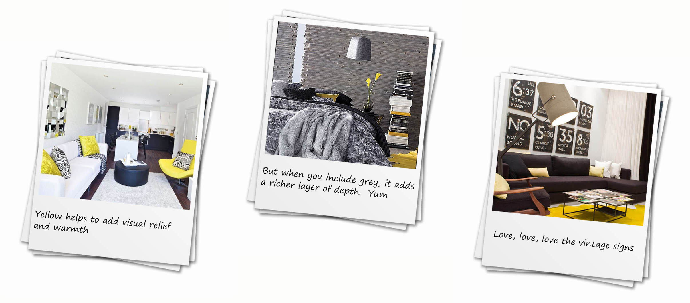
But there is one further element that adds so much more visual stimulation to the black and white colour scheme and that’s the addition of yellow and grey. I don’t know why this works. I’ve thought about this quite a lot and I just can’t put my bony finger on it.
It just does.
So, with the above in mind, I set about creating a bedroom using this refreshing, clean and modern colour palette. Here it is in all its (virtual) glory.

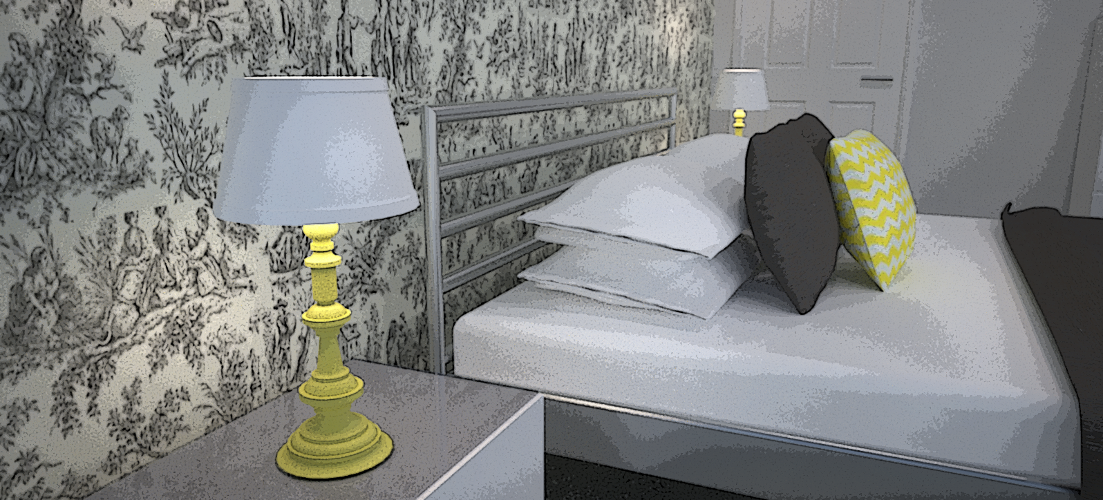
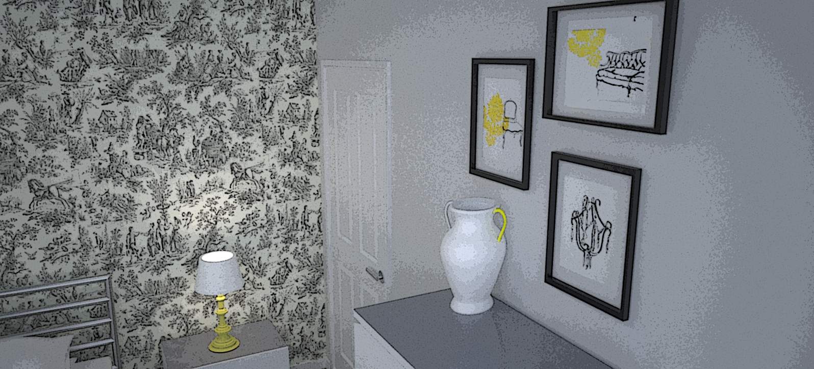
How did I put this design concept together? I took inspiration from the architecture of the apartment’s surroundings. There is a courtyard nearby that is dotted with huge stone columns. The minute I saw them, I thought ‘classical’ and ‘Georgian’ came to mind. I wanted a pretty impactful feature wall, so I chose Toile de Jouy – a particular favourite during the Georgian period. But I chose charcoal grey to keep the design modern.
I was instantly drawn to yellow lampstands to keep things edgy, with simple white shades and then stumbled upon these great prints that were hand printed. They have an awesome yellow Damask pattern (also strongly associated with the terms ‘classical’ and ‘Georgian’) and include drawings of period, classical furniture. To underpin this contemporary design scheme, they’ve been framed using black. A yellow Chevron patterned cushion has been added to further reinforce this contemporary look and to contrast with the traditional wallpaper. A charcoal grey throw and cushions has been suggested to compliment the grey in the wallpaper and to add a little depth.
There are strong colours in this design concept and there are equally strong patterns but because they have been used sparingly, the overall visual aesthetic is fresh but calming and restful. A win-win combination.


Start the Conversation!