The Psychology of Colour
I was approached by an Interior Designer a few months ago to create two different sets of 3D visuals for the same space. You see, two different design schemes were being proposed and the Designer was curious to see how each individual design concept would look in a photo-real 3D visual.
I was also interested to see how the two very different colour palettes were going affect the space, particularly the atmospheric and spatial qualities of the room.
When it comes to interior design, colour, is unquestionably a huge consideration because it can affect so many elements of a design. Colour can provoke many different emotional responses, from the fiery, dramatic and passionate connotations of red, to the nature inspired and earthy vibes of green and let’s not forget the visibly uplifting, zesty and refreshing allure of yellow.
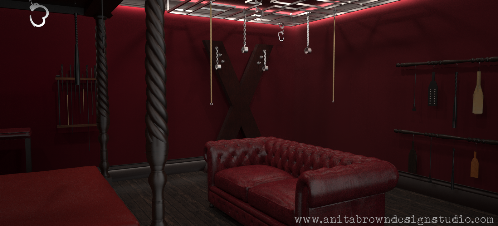
Remember the 3D visuals I created of the Fifty Shades of Grey ‘Red Room of Pain’?! What was it I said about red? Hmmm…
Colour can also have a dramatic impact on the perceived spatial qualities of a space, generally speaking darker, richer hues will make a room appear less spacious and more intimate, while incorporating a neutral colour palette in a room will undoubtedly help to open up the space by creating a light and airy aesthetic. If you’d like to read more on colour theory, click here.
But wait! Clever use of combining colours, can help to draw attention to statement pieces, structural elements or help to dilute an overpowering hue. This is where knowledge of that thing called, um, what is it…oh yea, the colour wheel, is handy!
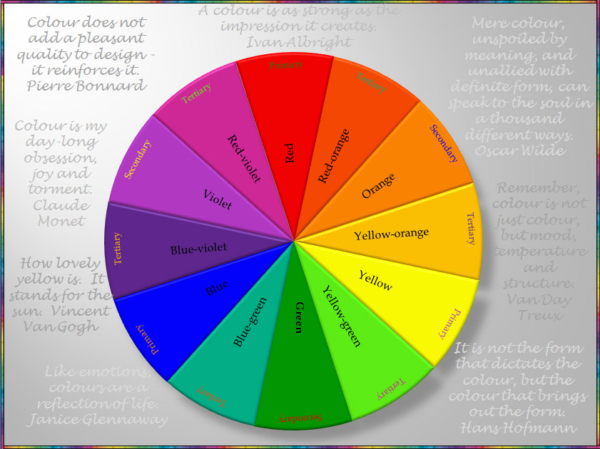
The Colour Wheel (with some added inspirational quotes)
But this isn’t a detailed lesson about the technicalities of colour. Honestly. This is about examining the merits (or lack thereof) of two different design schemes based on their respective colour palettes/furnishings and the resulting impact on the space.
*Rolls up sleeves*
*Does a few squats*
Ok, I’m ready.


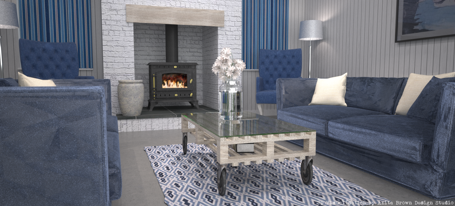
Blue/White room: Without a doubt, this scheme opens up the space very well, it highlights the expanse of space and the use of shutters ensures unobstructed views/lots of natural light. But in a room where white is the predominate colour, is it necessary to ensure all available daylight is maximised? I’m thinking that perhaps the use of so much white is a little counter-productive; combined with cool blue, the overall design atheistic is at risk of appearing a little lacking in warmth, especially with the use of concrete flooring. But I have to admit that the use of white frames the windows beautifully, allowing the views to take centre stage. This clean and simple colour palette has obvious nautical connotations and the overall design while modern, wouldn’t be considered contemporary. The exposed brick helps to add visual interest because of its texture and the distressed wooden plank above the fire does a lot to soften and inject a little character. The lush texture of the velvet sofas also assist in softening the crisp and minimal aesthetic of this design scheme. Pattern has been incorporated via the shutters and rug, which helps to lift the design. The upcycled coffee table is a very welcome distraction to this understated design.
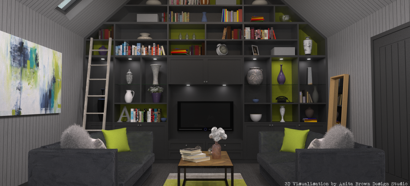
Grey/Green room: This space instantly comes across as contemporary due to the colour palette of grey and green and the use of industrial inspired/vintage design elements. The height of this space isn’t as obvious due to the darker hue and the views are slightly obstructed because of the chosen window treatment. However, the atmospheric qualities of this space are difficult to ignore: it’s moody, dramatic and the room in general has presence. The use of wood adds warmth and richness and its lighter shade against the backdrop of grey has retro connotations. The use of pattern in the cushions and rug helps to visually lift the overall design, with the entire colour palette being pulled together via modern statement art. The addition of a chandelier and silk curtains injects a luxurious and glamorous feel to this space.
Here are a few more comparison images:


I have my preference, which is yours?
VOTE NOW!
Please feel free to add your opinions on these two very different design schemes in the ‘Other’ section of the Poll or in the comments section below!


Start the Conversation!