3D Visualisation Project – Homebase
Firstly, for those of you reading this and wondering what on earth Homebase is; it’s a DIY store based in the UK.
But it would appear that Homebase now offers much more than just sandpaper and dust cloths. I recently dived into the Homebase website and had to physically lift my chin from my biscuit coloured carpet when I saw the sparkly, edgy and downright fabulous interiors ‘stuff’ that graced my laptop screen. Admittedly, the many contributions from Habitat (Homebase stocks A LOT of Habitat products these days), was the major contributor to all of the yummy interiors pieces that I greedily peered at. You gotta love Habitat, right? They are renowned for being ‘on the pulse’ where interiors are concerned.
If it’s funky, contemporary and chic that you’re after, then you NEED to check out Habitat.
Anyway, I’m digressing. With all due respect to Homebase, in the past if I was conducting research for a design scheme or was interested in purchasing something for my home, I wouldn’t have factored this retailer into my shopping spree. Aside from DIY products they did sell homewares but they were usually more on the ‘safe’ and unassuming side of the coin.
Nowadays, that’s no longer the case. They stock a wide range of interiors goodies and from a variety of suppliers, for example not only can you pick up a Habitat cushion but there’s also art from Kelly Hoppen to choose from. I’ve got your attention now, right?!
So, to cut a long story short, I decided to set myself a Homebase challenge, where I designed an entire room with nothing but Homebase products. There’s a teeny, tiny ‘but’ here. I DID use a little bit of my interior design know-how to inject an eclectic, contemporary vibe. I wanted this space to be the epitome of ‘urban chic’ inspired design. I wanted it to be dramatic, urban and sophisticated, with a little bit of glamour.
AND I wanted to shock people, when they realised that this contemporary design was pulled together from products available at Homebase (I want to add that I would NEVER recommend designing a space using products from only one source; this is a design challenge for me to flex my interior design muscles!!).
Enough rambling. Let’s take a look at the good stuff!
BOOM!

I’m almost certain that you’re going to want to click on the above 3D visual to increase your viewing pleasure!
My starting point for this design scheme was the brick effect wallpaper. All of the other walls have been painted in a similar shade of grey to reinforce this urban and slightly edgy look. It also keeps things consistent and allows statement pieces and accent colours to shine.
There are quite a few statement pieces in this room; my favourite design element is without a doubt the Habitat dining chairs. They’re very similar in design to the more traditional Windsor chair but have been seriously pimped with their various funky hues.
When I saw the green one, I HAD to include it, then I got greedy and added the lush grey one. If I could, I’d have one for every day of the week. They are bursting with personality, they add a vintage quality to a contemporary interior and make a serious design statement. Heck, in this design scheme, they’re almost a form of’art’
I wanted to add storage and decided to use a bookcase that is available from Homebase (it’s called Maine) but I’ve painted it the same grey as the walls (I got this tip from Abigail Ahern). Painting it grey adds consistency, it gives the bookcase a modern touch and it doesn’t stand out too much and detract from the rest of the room. I also positioned the shelves more randomly to add a little visual interest. There’s lots of eye candy in this bookcase to keep greedy eyes satisfied! Cushions, books, art, a desk lamp, vases, a clock….you name it, it’s in there. I love the addition of art in a bookcase. It’s slightly unexpected but demands attention.
To keep the expanse of wall from looking too desolate, I added more art but this time I used a Flock wallpaper (yes, this is available from Homebase). It adds glamour with its reflective qualities and also softens the more ‘urban’ inspired designs with its delicate floral pattern. If you are slightly nervous of pattern, this is a great way to incorporate it within a design scheme, especially because it can be easily removed/replaced. The glamour factor is maximised with the addition of a chandelier – there are many different styles available from Homebase but I kept the design of mine simple and elegant. I think the placement of this chandelier is absolutely genius. No one expects to see a chandelier perched near a wall but that’s the whole point.
It’s different.
It helps to illuminate the metallic wallpaper.
It’s a great contrast to the brick wallpaper.
It adds drama.
I could go on, but I won’t! I’ll post an image of this design scheme at night instead, just to prove my point.
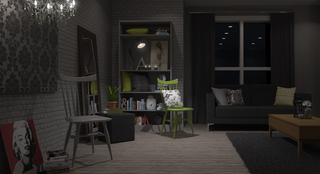
The popart canvas of Marilyn lying lazily against the wall, is another interior design trick to reinforce the casual and contemporary design style within this space. If you look closely you’ll notice that the flock ‘art’, chandelier, grey chair, popart canvas and books are all placed in a group – a little design feature in their own right. A little cluster to keep the space visually interesting. These items weren’t placed here by accident, this was very intentional.
Texture has been added via the rug and the Habitat ‘cube’ (I’m not sure what the correct term is for this piece of furniture: ‘cube’ seems a little underwhelming). Vintage charm has been introduced with the oak coffee table – incorporating wood in this design provides an injection of warmth and its vintage qualities ensures that the overall design is multi-dimensional. The cushions highlight the grey/green colour palette; all the cushions bar the grey and white floral cushion (on the green chair) are available from Homebase.
The side tables are from Habitat and combine the richness of wood with a simple, modern glossy black top.
What’s NOT to love about this design scheme?! I hope I’ve proven that with a little thought and a dash of creativity, any space can look good; you don’t need to part with your hard earned cash at a high end designer store. Homebase (and Habitat), clearly has everything you could possible need to create a contemporary, urban and chic interior (for the purposes of this challenge!! Again, I would NEVER recommend designing a space using items from only one Retailer!!).
Those dining chairs are so awesome that they deserve to be put on a stage, under a huge spotlight. But that’s kinda out of my remit. So I’ll do the next best thing – I’ll give them centre stage in one of my 3D visualisation animations.
It’s the least I could do.
ROLL VT!
***The following footage contains flashing images***


5 Comments
Enjoyed reading your post! So many people look at the products they like and forget (ignore) how important it is to apply the right lighting! Well done!
LikeLiked by 1 person
Thanks for taking the time to read this post! I’m glad you liked it, Amy. Yep, lighting is so crucial and can make such a huge impact!
LikeLike
[…] Anita Brown […]
LikeLike
[…] all started with my Homebase challenge, where I decided to create a design scheme using nothing but Homebase products. This type of […]
LikeLike
[…] First up is a no-nonsense vintage coffee table in oak. I created this 3D model for a personal interior design project. […]
LikeLike