3D Visualisation – On The Fly
3D Visualisers, regardless of their specialism (product design, architectural visualisation or exhibition design), usually follow the same process when it comes to constructing a 3D model and this process begins with dimensions. If it’s an interior or actual building, a floor plan and/or elevations must be provided to ensure the accuracy, precision and realism of the final 3D Visuals.
But sometimes, this process can’t be followed. I like to call this type of 3D modeling ‘on the fly’.
In my experience, the genre that falls into ‘on the fly’ are projects within the event design industry, where the building/interior is already in situ and technical floor plans aren’t readily available.
In order to convey an event design concept as cohesively as possible, it is usually beneficial to illustrate these ideas within the actual space, to ensure the prospective client can fully appreciate the concept designs within their architectural environment.
This is where my role and skill as a 3D Visualiser is put to the test. I’m not going to lie, constructing a 3D model of an interior space without dimensions and having only photographs as a reference point can be challenging and time consuming (especially when there are noteworthy architectural features).
But it is achievable.
And usually because of this 2D component.

Every version of SketchUp has its own default 2D ‘person’ and when I start the (sometimes daunting) task of constructing a 3D model by eye I use this component to assist when gauging height and proportion. Mighty useful, I’m sure you’ll agree.
I’ll also focus on a particular architectural/design feature when commencing the construction process and continue to build the space from that initial starting point.
It’s crucial to study as many photographs of the space as possible and at a variety of perspectives to ensure you are familiar with all of its nooks and cranies (and architectural features).
Warning: no matter how many times you think you’re familiar with the space in question, you will revert back to photographs while you are creating the 3D model CONTINUALLY.
Neck strain? You’ve no idea.
It’s important to note that any 3D visual produced using photos alone, will never be 100% accurate. It’s simply impossible but it will provide a pretty good idea as to the general visual aesthetics of the design concept in principle.

Image credit: The Events Mill
This is Park House in the centre of London. I was required to construct a specific section of the interior on level 6 for a professional commission, however I haven’t presented that actual design due to client confidentiality. So, I’ve used the original 3D model that I created of this space and redesigned the interior – think of it as a cool break-out area for an office space. I know, I’m excited too.
This is pretty much a blank canvas, let’s see what happens when I introduce a cosmic colour palette and a few well chosen pieces of furniture and accessories, shall we?
Remember: I’ve never set foot in this building and I’m about to show you a photo-real 3D Visualisation of this space completely redesigned.
Have I ever mentioned how astounding 3D Visualisation software is? Yea, I think I have.
BOOM!
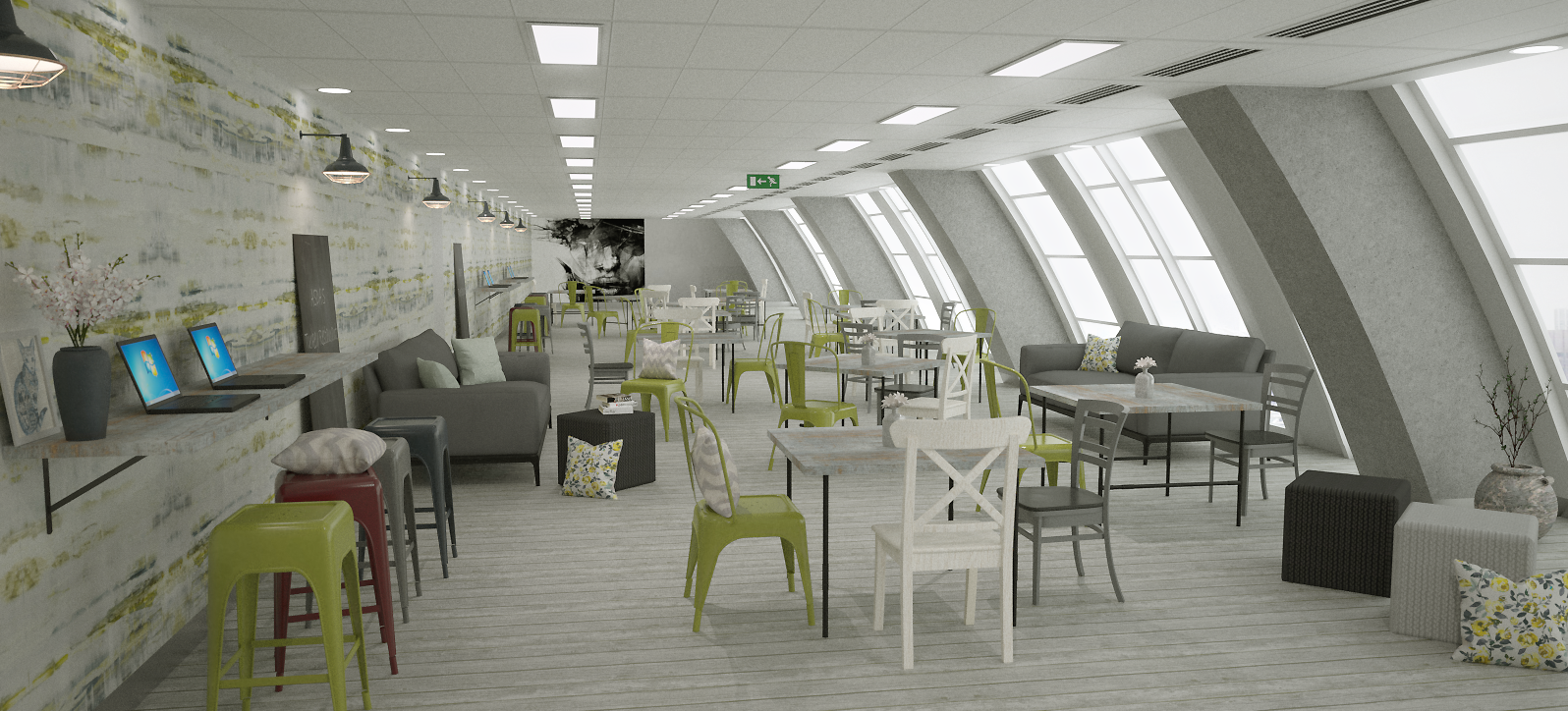
An office break out area that oozes urban, contemporary styling
As I previously mentioned, I’ve presented this space as though it is being used as an office break-out area (think Google and Facebook, yea?). Having a funky and downright awesome break-out area is a luxury (in my office anyway), so I pushed the boat out a little.
As you can see, the general features of the original space have been captured in my 3D model: the curved pillars and the windows on one side and the expanse of wall opposite. I’ve also included the lighting already in situ – I’m not a fan of those rectangular ceiling lights but I’m guessing they’re ‘efficient’ and whatnot, so there’s probably a good reason why they’ve been included in this building design, so I included them. I also wanted to illustrate just how close 3D Visualisation can replicate lighting in an interior.
Let’s talk colour!
Considering Spring has been tapping on our shoulders for a few weeks, I’ve decided to use a zingy and refreshing colour palette. My inspiration for the combination of greys and chartreuse (yellow-green) was the Jessica Zoob wallcovering (sold by Romo Black Edition). I’ve mentioned Jessica’s work in earlier posts (Autumn Inspired interior and again when I discussed her paintings) and couldn’t resist this particular wallcovering.
As Park House is located in central London, I wanted the interior to have a very strong urban vibe without being too masculine and cold. Jessica’s wallcovering, whilst grungy in appearance also has a softness due to the fact that it was originally a painting, the charteuse shade also helps to inject a welcome burst of colour.
Plus, grey and yellow (or relatives of yellow), is a fantastic colour combination (check out my inspiration section for more examples of cool colour palettes). The grey helps to keep the overall look very chic and contemporary (great for an office environment), whilst the accent of yellow (or in this case, chartreuse), counterbalances any perceived coolness from the grey.
It was a no-brainer. I was using it.

Jessica Zoob wallcovering – ‘It’s Complicated’
The accent colour of chartreuse is continued via the Tolix chairs and the floral fabric, again from Romo Black Edition. I chose floral fabric to help soften the contemporary, urban aesthetic of this interior. Incorporating cushions alone, would add softness to this scheme (especially when dotted around randomly) but I wanted to ensure the scheme didn’t appear too masculine. A very subtle grey chevron fabric has been used (Occa Home) just to add a little bit of interest. Plus, it looks great with the Tolix.

The mighty Tolix
Who am I kidding, a Tolix looks great with anything.
I’ve included a few different styles of seating (and various hues) to underpin the contemporary and casual vibe in this interior.
I wanted some form of industrial statement lighting and decided to use factory inspired wall lights. In the Jessica Zoob wallcovering, there is a deep grey/blue shade and I used this shade for the wall lights to add a little depth (and to break up the grey/chartreuse palette). Check out Skin Flint Design for similar vintage designs. The blue/grey shade has also been used on the vase and one of the Tolix stools. Did you notice?! Admittedly, the visual impact of the wall lights has been diluted somewhat because of the ceiling lighting within this space (yep, those ceiling lights anger me, moving on).
Again, Tolix makes another appearance via the stools at the dedicated ‘Googling’ area (yes, it’s a Windows home screen, what can I say, I’m a Windows gal!) and the industrial theme is continued with the same rustic wood for both the counter and table tops. I couldn’t resist including the funky print of the cat that I talked about in my post for Mother’s Day gift ideas, come on, it looks freakin’ awesome. The fact that it’s been printed onto the page of a vintage book is too awesome for words. This is the work of talented Artist, Roo Abrook.

Print of a cat on the page of a vintage book, anyone?
You might have noticed that the pillars aren’t white as in the original photograph. The beauty of 3D Visualisation is that you can magically change anything you like and I did in this instance. Nothing spells ‘urban’ quite like concrete and the colour tied in well with the colour palette, so the white paint finish had to go.
And lastly, I wanted to include a statement piece of art in the form of a wall mural. I wanted it to be edgy, grungy and urban. I also wanted to position it on the back wall in the scene, mainly to help draw the eye and prevent this long space from feeling like it was a large, endless corridor.
What a seriously cool piece of art! This is the work of Russ Mills. I highly recommend that you check out his website if you dig this particular style.

I hope this little personal project has proven that a 3D model can indeed be constructed using a photograph AND a blank canvas can be transformed into an interior that is understated but with bags of style and personality. And I didn’t need to step outside of my office to do it!


Start the Conversation!