My Apartment Has Portholes!
Ok, when I say ‘apartment’, I mean apartment reception area.
And when I say ‘portholes’, I mean mirrors. But you know, same thing.
Let me give you a little background. I live in an apartment building situated in Belfast city centre. At 279 ft it is Ireland’s tallest building and as such is the closest thing we have to anything that resembles a skyscraper.
Here’s a little montage of photos of my house.
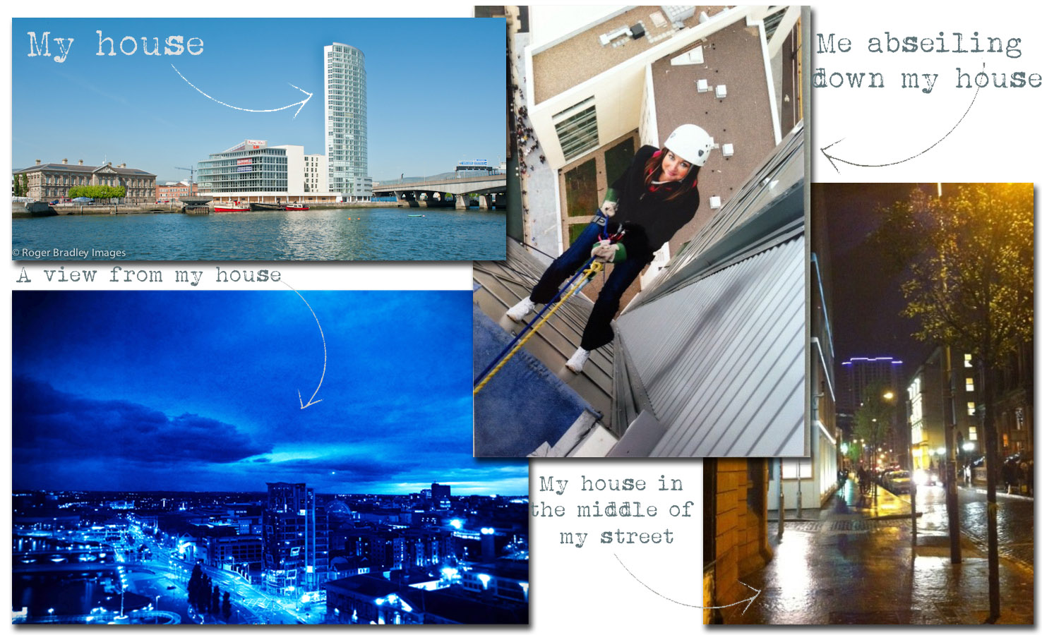
As you can see, it’s a pretty awesome place to call home. But the reception area was always a bit vanilla. It didn’t reflect the awesomeness of the building at all. It was unoffensive with a lot of natural stone and neutral walls but it didn’t say:
I’m the tallest building in Ireland! Don’t mess with me!
But it has a flippin awesome reception now thanks to Caroline Fletcher Interior Design!
I was like a moth to a flame when I first spotted Caroline’s presentation boards being displayed in the reception area pre-makeover. These presentation boards illustrated the colour palette, fabrics, flooring and furniture that was going to be part of the new design.
I decided to Tweet Caroline to express my joy, excitement and general emotional state.
I may have also updated Caroline once the redesign was underway, merely to convey my approval and delight that this was actually going to happen.
Understandably, this was probably her reaction. 
I informed Caroline that I was definitely going to take photographs of a few of the design elements and true to my word, as soon as the last few bits n bobs were in situ, I grabbed my trusty camera and took a few snaps.
Before we start, this is the ‘before’ photo. There were a few changes to the layout after this photo was taken but it should you give you a general idea of the ‘vanilla’ situation. Oh, those gorgeous upcycled chairs are my handy work – if you’re interested in reading more about this project, click here.

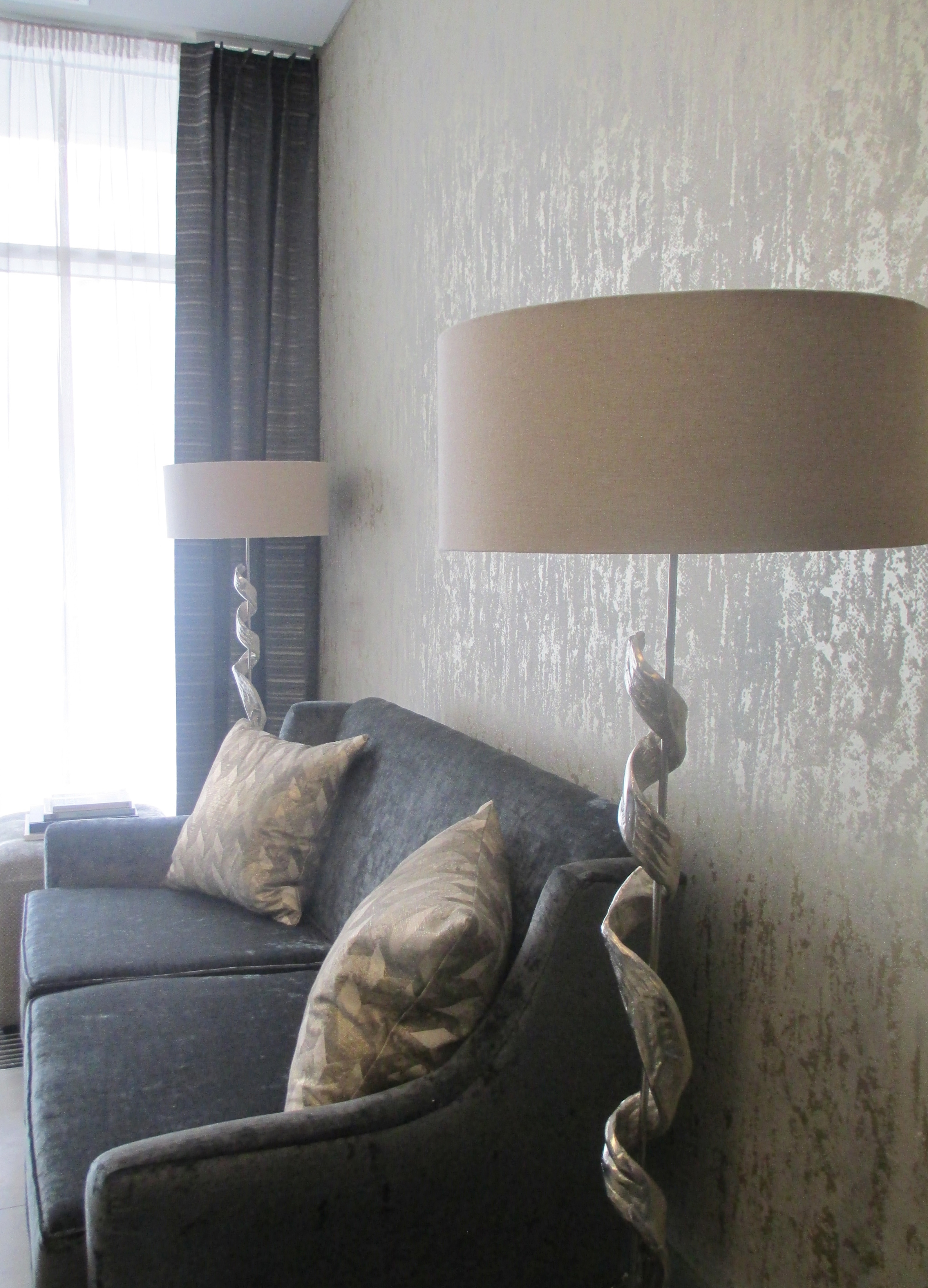
In my eyes, the look that Caroline has opted for is definitely a boutique hotel vibe, with lush fabrics and a sophisticated (yet slightly dramatic) colour palette of earthy tones, combined with gold. To add a little relief from the darker tones in the design, metallics have been dotted throughout. The wall covering is a feast for the eyes, especially in the evening light when it glistens to great effect.

There’s subtle use of pattern in the cushion fabric and curtains, that work in harmony with the overall aesthetic of the space. The sculptural floor lamps ensure that there’s little pockets of visual interest. The floor lamps are one of my favourite design elements, for sure.
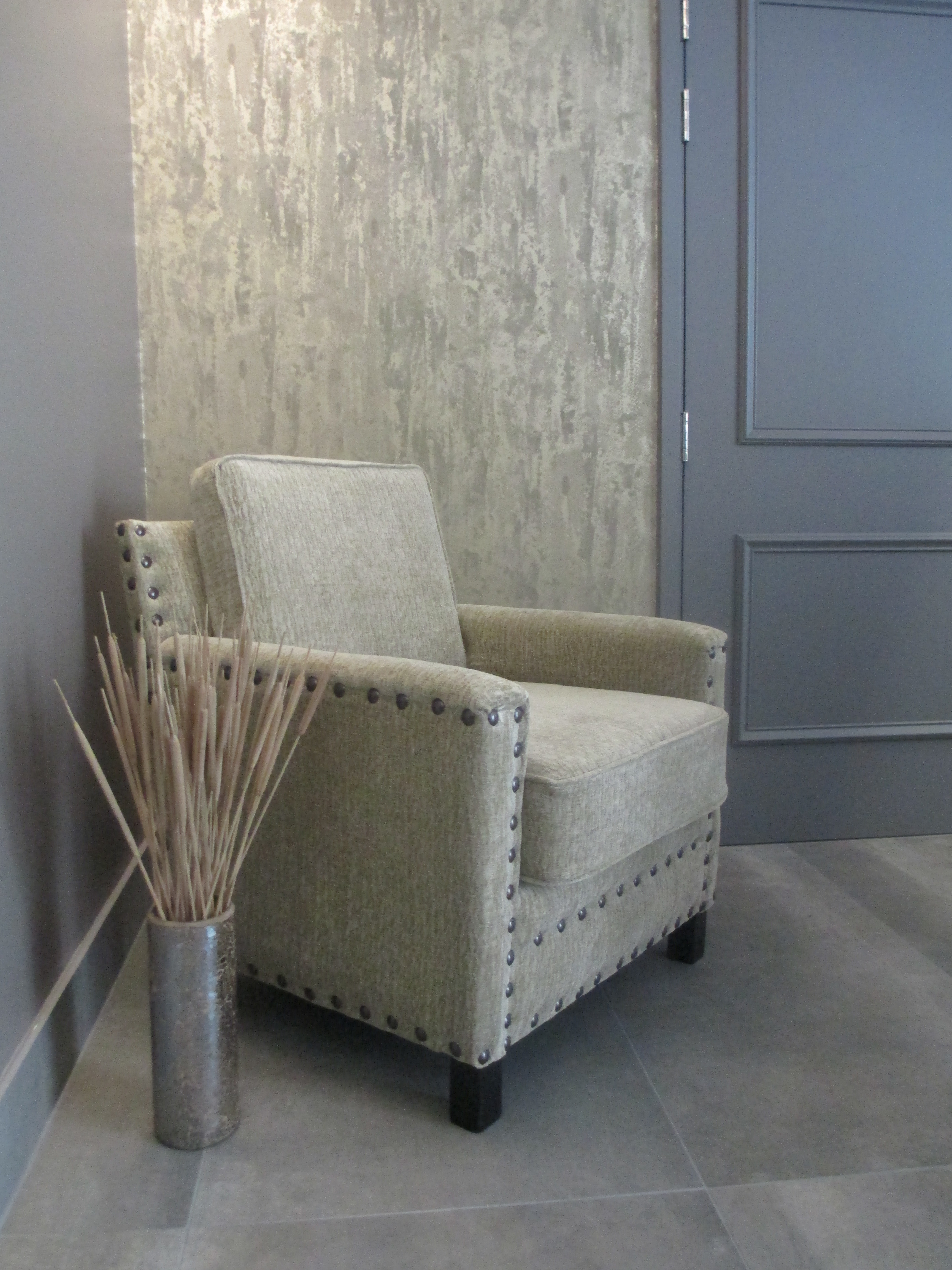
Remember I discussed the power of the statement chair in a previous blog post? Here we have a lovely (and mighty comfy, may I add!), chair with studded detailing. The photo below brings me conveniently onto the subject of the flooring. This snap does NOT do this flooring any justice whatsoever! These tiles are such an interesting combination of various shades of grey and they compliment the muted tones in this design scheme beautifully.
Finally, I couldn’t resist taking a photo of these bad boys! As soon as I saw them I shouted ‘Portholes! They’re portholes’!
Yes, I got excited about mirrors passing themselves off as portholes. Moving on.
My apartment building is right in the centre of Belfast. Belfast has a HUGE industrial history and Obel is also situated near Belfast Harbour (and right around the corner from where Titanic was built). I LOVE the fact that Caroline has paid tribute to Belfast’s maritime history. Bravo!
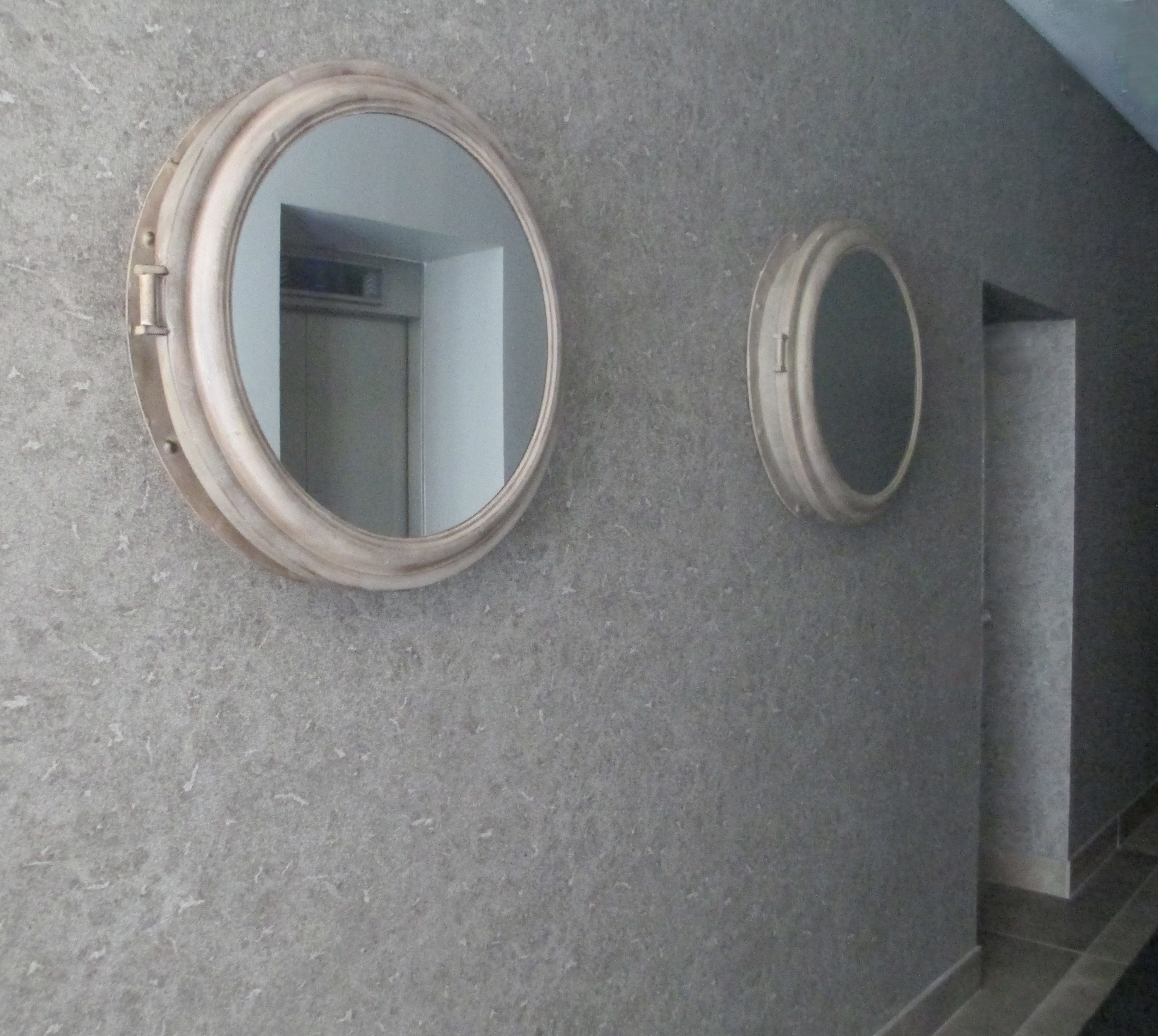
I couldn’t resist an arty close up!

In a nutshell, Caroline has managed to take an interior that was ‘meh’ and transformed it into a space that is rich, sophisticated and pays homage to Belfast’s shipbuilding roots. And I absolutely love it!


2 Comments
Hi Anita, really do like the design and personally as a decorative artist I could replicate all the finishes which are represented here including the textured wall design ( which I already have) The use of leaf and/or foil is perfect for the room setting and you just got to love the portholes.
However I see there are two different wall designs the one with the portholes looks to be more of a wallpaper while the finish on the accent wall in the living is more vertical textured look.
My question is have you seen what has been going on in the decorative art wall finishes involving mica flakes? I would really like to hear your insights on this and was wondering if the accent wall was done by an artist and why the name of the artist was not mentioned?
Anyway just wanted to say that the room design is wonderful and if ever you are in the Naples Florida area give me a shout before using wallpaper……. Peace!
Arthur
http://Art-Faux.com
LikeLiked by 1 person
Hi Arthur. Thanks for your comment!
You have a good eye for detail! There are two separate reception areas of my building and I didn’t want to complicate matters by going into the details. But well spotted!
Both feature walls are wallcoverings. An artist wasn’t involved in their creation. I’m glad you like the overall design and those portholes!! Awesome!
I’ll be sure to check out your link, thank you for providing it 🙂
Anita
LikeLiked by 1 person