How To Bring Scandinavian Style To Your Interior
I’m referring to my new Scandinavian design as ‘micro’ because I’ve selected a small design element from a living area, to illustrate just how easy it is to incorporate a little bit of Scandi into your life!
You might have noticed, that I’ve recently become beguiled by Scandinavian design, (check out my recent Scandinavian inspired bedroom design here), and it’s easy to see why. It’s so clean, simple, uncluttered, soothing and downright funky.
I really, REALLY love it.
And the icing on the cake, is that once you understand the characteristics of Scandinavian design, it’s really quite simple to inject elements of this style of interior design into your own space.
Let’s do a quick rundown of some of those characteristics:

There’s probably a few more that could be added to that list, but if you’re a newbie to Scandinavian design, the above is definitely a good starting point. I decided to create a design that made use of a feature wall: a very muted green/grey shade. I was very drawn to this tone because it was so striking, yet soothing at the same time. I appreciate that my last sentence makes absolutely no sense but hey, I’m a Creative, we rarely make sense.
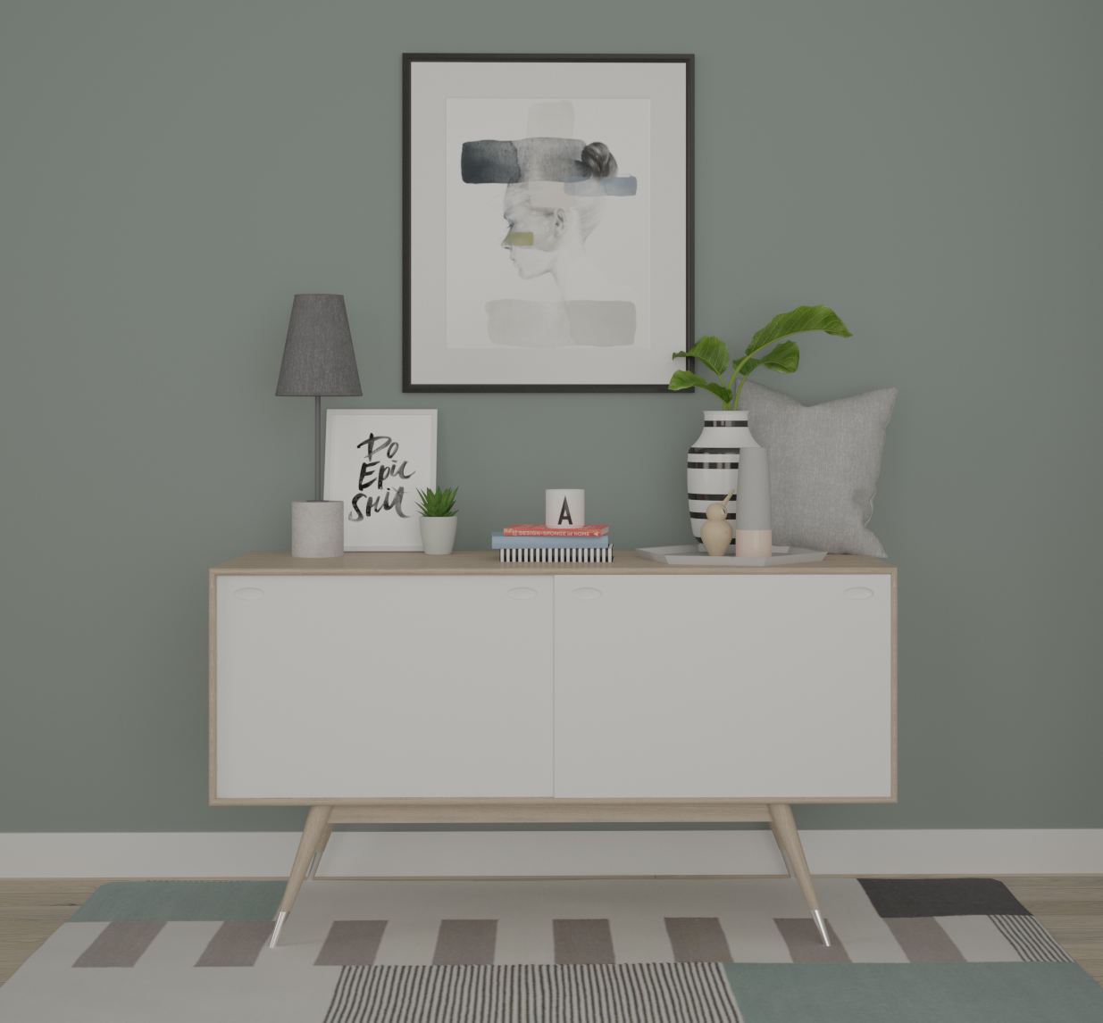
Let’s take a look at the final design, then I’ll explain my process and tell you where to shop the look!
And here’s a different view, with another lovely little snippet of detail from this design.

First up, the wall colour. This is a very special wall colour, it isn’t from the leading UK suppliers/manufacturers, it’s actually from a Norwegian company.
You could easily pick this shade from one of the many UK paint retailers (or something close), but I definitely feel that using a Scandinavian supplier, is so much more authentic and just plain cool.
This wall colour is called ‘Balance’, and is available from Jotun. It’s a soothing mix of green/grey and is crisp and fresh when combined with white. LOVE. Find out more about this paint colour here.
Next, is the rug. Oh my, how I love a carefully co-ordinated or contrasting rug in an interior! They are AMAZING at pulling an entire design scheme together! You only need to look at my previous design schemes to see the evidence first-hand. Check out my Blush and Navy design, or my Urban Christmas scheme for more inspiration.
This rug grabbed my attention because of the interesting (and slightly random) pattern, that I felt was very reminiscent of Modernist design. The selling point was most definitely the similar shade of green used in the colourway.
It was a no-brainer, it was perfect for this scheme.
This rug is from Heal’s. I highly recommend giving their entire range of rugs a nosy! In my humble opinion, they have one of the best selections of rugs to choose from.
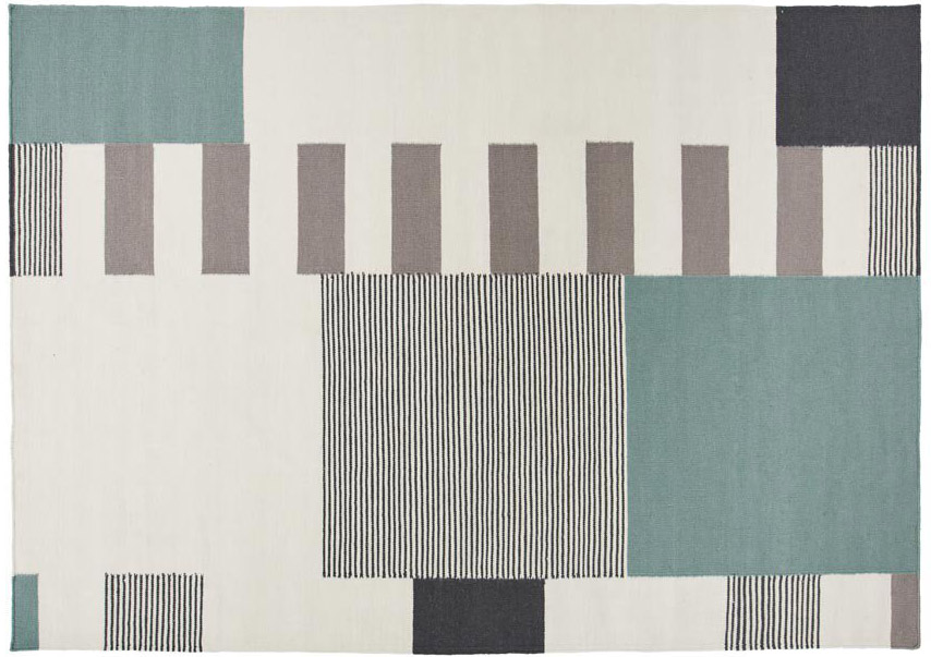
‘Graphic Rug’, Heal’s
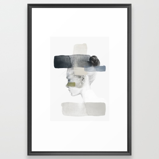
The piece of art is where I deviated from the more traditional elements of Scandinavian design. Typography and graphic (Modernist) prints feature heavily in this style but I wanted to soften this scheme by incorporating a portrait. I love its simplicity but I REALLY like the random brush strokes of muted tones. I think it works really well in this space.
It’s called ‘Insideout’ and can be purchased at Society6.
I’ve developed a little bit of an obsession when it comes to sideboards. I find them to be one of the most practical, yet aesthetically pleasing items of furniture that can be incorporated into a design scheme. I don’t own a sideboard (sob) but I’d love one.

This little fella is a mix of Danish and retro influences and can be snapped up at Wharfside. The metal detailing on the tapered legs sealed the deal for me. A nice touch.
Let’s take a closer look at the vignette on top of the sideboard. Feel free to click on the image to increase viewing pleasure!
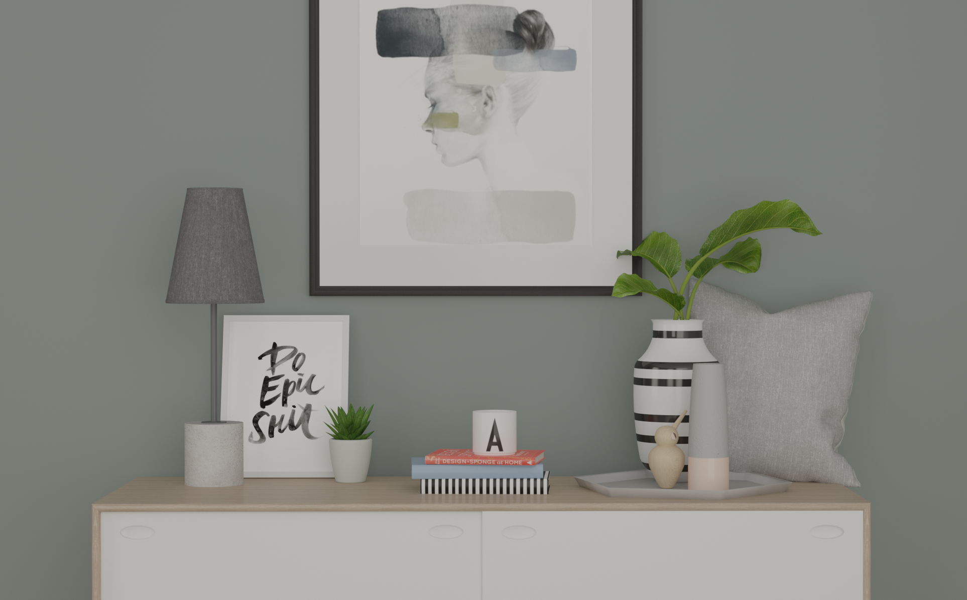
One of the biggest mistakes you can make, when it comes to Scandinavian design is OVER style.
This look is centred around simplicity. So careful consideration has been given to the choice of colours, patterns and how the objects have been arranged. Plus, I didn’t want the piece of art to compete too much with anything on top of the sideboard. Stripes, circles and chevrons are all patterns synonymous with Scandinavian design, so it was obvious that I was going to go for a stripe, because I dig stripes A LOT. The striped vase is a fantastic contrast to the green/grey of the wall. I love how the muted tone of the wall colour allows pattern of this nature to stand to attention. The Omaggio vase is made by Danish firm, Kahler, and can be purchased from Scandinavian Design Centre. I added a strong element of greenery because it’s so vital to a Scandinavian scheme and felt that the size of the vase warranted it.
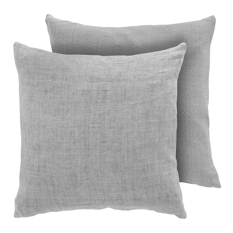
I love placing cushions in all sorts of random places, and decided to plonk one on top of the sideboard. It’s unassuming but still provides softness. Buy a similar one at Scandinavian homewares store, Hoo-gah.
The tray is from Hay Design (HUGE in Scandinavian design) and can be purchased at Made In Design. Equally huge is the wooden bird. This is probably one of the most recognised symbols of Scandinavian design in existence. A little predictable to include it in this scheme? Maybe. But it’s so simple and cleverly engineered (you can move the head in different directions to convey various emotions), that I felt it earned the right to be there. Grab one at Trouva.

I’ve used the concrete effect and pink vase in a previous scheme. I’m a huge fan of this vase because of the contrast between the coolness of the grey and the softness of the pink colour. Plus, it also breaks up the overall colour scheme. These are available from Cox and Cox.
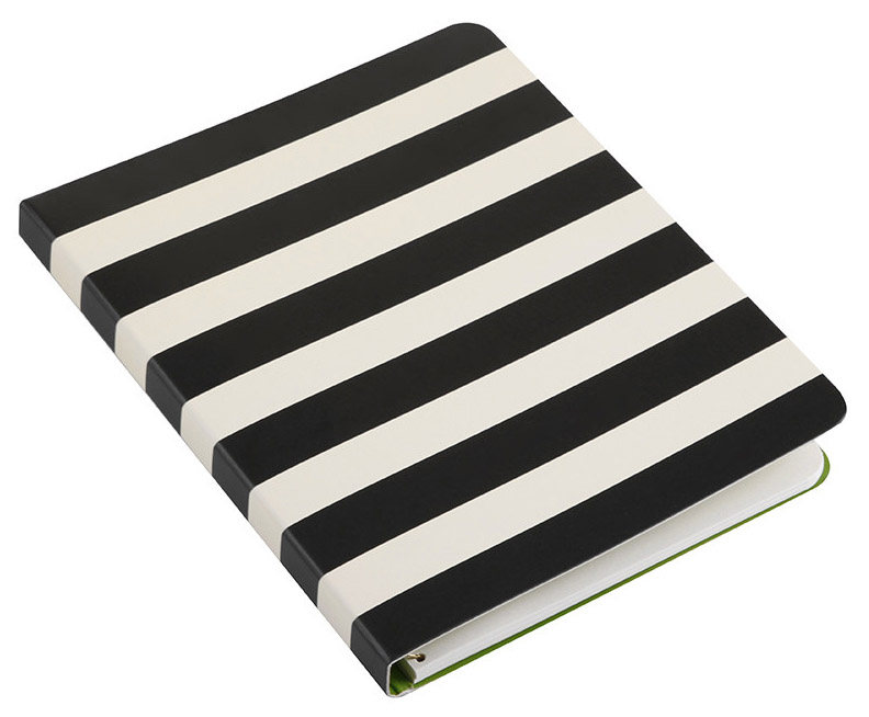
Books are ALWAYS a welcome addition to any design scheme, and their colours/designs help to add a little bit of visual stimulation. The striped one (surprise, surprise) is my ultimate favourite. Kate Spade has a similar one, which can be purchased at Amara.
Typography, is a fantastic way to add impact and individuality and it’s pretty popular in Scandinavian design. I’ve used quite a few typographical elements in this interior, from the letter A on the mug, the print (it’s possibly a little risque but what a great sentiment!) and the numbers on the espresso cups, which are positioned on the wall shelf.
There’s something a little bit special about the font used for the mug and espresso cups: they are the actual font, originally designed in 1937, by the world famous, Danish Architect, Arne Jacobsen. Well, I DID tell you they were pretty special!
Grab the espresso cups here and the mugs here.
Oh, the grungy desk lamp is from Made.com and provides a nice little dollop of texture in this scheme.
I recently became aware of a Scandinavian homewares brand called Sostrene Grene, as they are opening a new shop in Belfast (sometime in November). As I was having a little browse through their online catalogue, I spotted a very simple wall mounted shelving unit, that I felt would be perfect for this design scheme.
So I made it happen.
The black candlestick holders add a punchy statement to the white wall and are available from The Third Row, the brass tealight holder, with its characterful patina adds much needed texture and can be purchased at Hoo-gah.

AND LASTLY, (phew!), the minimal clock, which reinforces the overall clean, simplistic Scandinavian vibe, can be bought at Nest.co.uk
I hope you enjoyed my new design scheme and my process of pulling this look together. What is it about Scandinavian design, that attracts YOU?! I’d love to hear from all the Scandinavian fans out there! Feel free to drop a comment below!
![]()


2 Comments
Loving the whole look Anita, especially as I find the colour green so soothing and restful. I could quite happily stare at that wall all day 😀 I still can’t believe how realistic your 3D visualisations are…… you literally bring a design concept to life!! You are one talented lady 😀
LikeLiked by 1 person
Thanks Maria, really glad you like it. Such a small design scheme and it took AGES to put together! Grrrr!! I agree, the wall colour is sublime! Thanks for the shout-out on the 3D front! I kept the lighting very natural (no artifical lighting at all) and sometimes it can be a hindrance to the photo-realism when using natural light only (for interiors anyway), so I was a little concerned about that
LikeLike